| Kowalewski Residence: Three Views of a Family Belmont Freeman’s first stand-alone house addresses the contemporary needs of domestic space in three ways
Summary: The Kowalewski Residence in Atlantic Beach, N.Y., is a Modernist house that presents three distinct faces of varying transparency and material composition that each respond to site context and the clients’ desires. As a modest, compact design, the house refers back to the original Art Deco and Tudor style homes first built in Atlantic Beach and stands in opposition to the sprawling McMansions that have sprung up in the town more recently.
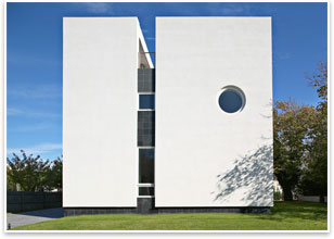
And, as such, the house doesn’t settle for a single gesture. In response to its site context and clients’ desires, the Kowalewski Residence assembles three distinctive façades that are alternately winking and bashful, grounding and calming, and embracing and comforting; all well adjusted into a proportional and balanced composition. Shrinking into scale So, Freeman and his eponymous firm wanted to design a house that worked at the original scale and proportion of the town’s first homes. “I wanted a fairly compact, tight house,” he says. “It is quite a distinctive difference from the sprawling houses people are building.” The Kowalewski House (complete since September of 2007) is succinctly Modern and self-contained. From certain angles, it’s nearly a perfect cube, and it preserves much of the lot for garden space. A black slate slot in the white façade that runs the height of the house gives the appearance of two asymmetrical rectangular volumes fusing together. Freeman says the house’s flat roof, materials (white stucco is the primary facing material) and clean detailing are sub-textual references to the area’s Art Deco heritage.
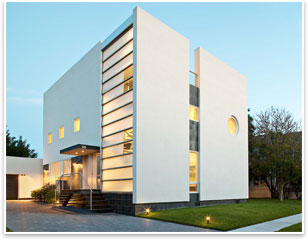
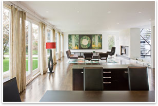
Now, Freeman says he prefers the newer design. The asymmetrical placement of the porthole window keeps interior life private but also contributes a playful, winking quality to the street. At once, it’s the house’s most reserved and yet enigmatic face. Freeman isn’t too concerned with conceptual justifications for the window beyond this. “You can always say [it’s a] nautical motif for a seaside community,” he says. The north face of the building is a calming and orienting initial arrival space. It contains the front door and is adjacent to the driveway and garage. The entire house sits on a base of black slate, but the north façade extends this cool, slick stone up through the first floor. Three small windows peer into the second story, and the west side of this elevation has a bank of horizontal frosted and clear windows that run the entire height of the house and look into its lone stairwell. This façade has the richest diversity of geometries and materials of all sides, serving to acclimate and preview the domestic life of the house for those about to enter it. The south face of the house isn’t nearly so coy and cautious. Here, the first floor is walled in only by windows, revealing its open loft floor plan. Beyond the windows is more private domestic space: a side garden, preserved by the house’s small footprint. Four additional windows are on the second floor, as well as a bedroom balcony. Cloistered by more opaque façades, this window wall creates a continuity of domestic warmth and comfort between the activity inside the house and outside the house in the garden.
Contemporary needs The three most expressive faces of the Kowalewski Residence are not arbitrary jokers’ masks on a revolving wheel, but instead careful and reasoned responses to the way contemporary families want their homes to function: as outward gestures to engage the world at large, as decompressing and reorienting transitions from the exterior world, and, as always, domestic hearths, enlivened by everyday acts of family life. |
||
Copyright 2009 The American Institute of Architects. All rights reserved. Home Page |
||
news headlines
practice
business
design
recent related
› Against Interpretation
› Tudor Place: Democracy Starts at Home
› MIT’s OPEN Prototype House Initiative to Test New Model for Creating Homes
› Method Homes Pre-Fab Prototype Walks the Middle Path
› KieranTimberlake Moves Pre-Fab into Mass Customization
› KieranTimberlake Designs Expandable Home and Flexible Town home
Photos:
All photographs by Christopher Wesnofske.
1: The west side street frontage façade of the Kowalewski House.
2: The north side façade of the house.
3: The glass-walled south elevation of the house.
4: The residence’s first floor is a loft-like open plan.
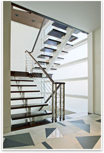
5: The house’s staircase floats on a steel tube.
See what the Housing and Custom Residential Knowledge Community is up to.
From the AIA Bookstore: American Masterworks: Houses of the 20th and 21st Centuries by Kenneth Frampton (Rizzoli, 2008).

 How do you . . .
  The Kowalewski Residence in Long Island, designed by New York City architect Belmont Freeman, AIA, is very much a continuation of his urban loft-influenced work but is also a break from the past. It’s Freeman’s first full-time-residence freestanding project, liberated from the exterior masonry walls of Tribeca and Midtown, finally giving Freeman an opportunity to express his outward conceptions of contemporary Modern dwelling space.
 Three faces
 The house’s east façade is relatively blank, though its entrance is recessed under an overhanging section supported by two columns, and black slate again covers the first floor.