| An Airport for All Channels a Nation’s Fascination with Flight Rafael Vinoly’s Carrasco International Airport in Uruguay redefines who an airport is for.
Summary: Carrasco International Airport drastically revises typical airport circulation patterns by accommodating Uruguayans’ exuberant enthusiasm for air travel. Vinoly’s design leaves an abundance of space for visitors who are accompanying travelers, in the hopes of creating an engaging and vibrant place. The terminal is covered in a dramatic and iconic curved roof that is supported by an elegantly light v-column and truss frame that adds to the atmosphere of fluid and dynamic travel by way of its lightness and buoyancy. While working on the Carrasco International Airport’s new terminal in Uruguay, David Rolland, AIA, the terminal’s project director with Rafael Vinoly Architects, came across a seemingly bizarre tidbit of travel culture. In Uruguay, non-traveling visitors who are seeing friends and loved ones off or picking them up outnumber travelers by five to one. Rolland says that air travel in this small, remote South American nation is still regarded as an adventurous luxury, and worthy of a communal send-off, especially considering that air travel there is international by default. The only other airport in Uruguay is only open for a few months a year. To get on a plane usually means to leave the country. At the current Carrasco Airport terminal, family and friends picking up travelers or sending them off gather at a window-side restaurant in the hopes of seeing a first or last glance of their traveler. As jets hurtle down the runway, “everyone who is waiting for somebody runs up to the window and they wave,” says Rolland. “There will be a hundred people there waving. People are still enamored with air travel.” Rolland may not have been completely shocked by this travel culture revelation. After all, his firm’s namesake was born in Uruguay before moving to Argentina and later to New York to set up his practice in 1983. Nevertheless, this cultural recognition breaks down typical notions of who an airport’s presumed users are. This airport’s design accepts this fissure, and purposefully changes typical airport circulation patterns to create a small airport with centralized and universally accessible amenities that builds on Uruguayans love of air travel to foster a dynamic and enlivening space.
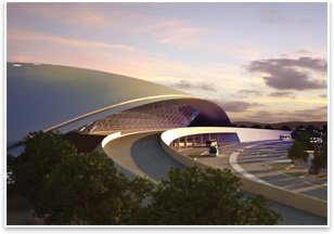
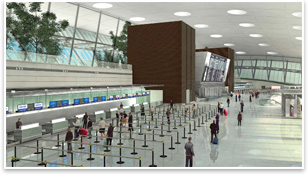
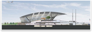
But this small size hasn’t precluded any formal imagination in Vinoly’s design. The tri-level airport is covered in a synthetic-rubber-clad roof that curves over it, meeting the earth at each lateral end with cantilevers and glass walls over the front and rear—a sliced and sectioned contact lens. The roof is supported by a series of steel v-columns that runs around the perimeter of the terminal. Steel support trusses connect the v-columns and extend down to the ground past the terminal building. Columnless, this allows a sense of buoyancy and airiness to predominate, with the thin v-columns acting more as mullions in the front and rear window expanses than support structures. “The fact that they are v-shaped, that they are off the pure vertical itself, helps to lighten it up,” says Rolland. “One doesn’t view them as columns.” Departure and arrival When it is time to say goodbye, travelers will return to the departure level and go through security and immigration to enter the main concourse, where more public amenities (magazine stands, food, etc.) await. Passengers have their tickets taken at one of four ticket counters, each of which corresponds to an immobile passenger bridge. Each of these bridges has two gates, though there is only one mobile jetway per bridge.
“Here, what we tried to do was always keep you on center so that you are never being thrown off to the left or to the right, that you’re going through the building symmetrically,” says Rolland. This succinct trip out of the airport can, of course, be interrupted by a visit to the upper terrace level. There, passengers can mingle with visitors waiting for other travelers to arrive, getting a meal and a drink while watching planes land and take off, suddenly liberated from the their typical posts in some of the most inhospitable waiting areas airports offer, squatting on baggage carousels and leaning against vending machines. Nostalgia tempered by innovation Rolland says Uruguayans’ passion for the democratizing possibilities of air travel was a critical ingredient in creating an exciting and enlivening travel environment. “It reminds me of what air travel used to be like here years ago,” he muses. |
||
Copyright 2008 The American Institute of Architects. All rights reserved. Home Page |
||
news headlines
practice
business
design
recent related
› Indianapolis Constructs Greenfield Airport
› Brazil’s Mendes da Rocha Wins Pritzker
› Small Liberal Arts College Quietly Amassing Superlative Design
› Architecture Whiz Kids Receive Internship for Forward-Thinking Airport Design
Visit the architect’s Web site.
Go to the Carrasco International Airport. (In Spanish.)


