| UC Berkeley School of Law’s Library Addition Sits Lightly and Gives Back What It Takes Away Ratcliff’s underground pavilion does its best to maintain public amenities and green spaces on a tight site
Summary: The South Pavilion addition to the Berkeley School of Law Library, Berkeley, Calif., offers a rooftop garden and screening system to replace the public amenity and green space consumed by its construction. Similarly, most of the building is placed underground to reduce the footprint of the building. From bottom to top, the building becomes lighter and more open, eventually becoming an ephemeral pavilion that steps gently on its site. When the University of California-Berkeley School of Law needed to expand their law library facilities, they were faced with two less-than-ideal options. They could disrupt the operations of their main law library, Boalt Hall, for years, or they could tear up a public courtyard in front of Boalt and build there. The law school, which had expanded their law school faculty by 25 percent in the past four years alone, weighted their options and let their architects, Ratcliff of Emeryville, Calif., decide. Joseph Nicola, Ratcliff’s director of academic practice, and his team decided to dig up the courtyard—removing a public gathering space and sorely needed foliage from a dense, urban campus.
Underground, in the hills
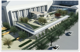
The most expressive features of the otherwise staid and rational Modernist glass pavilion are its topographically rich patches of green roof. Planted with trees and grasses, they run across the roof in thick, irregular strips, hemmed in by concrete and cast-stone retaining walls that match their topographic contours. These artificial hills, developed in conjunction with the project’s landscape architects, Hargreaves Associates of San Francisco, will rise up several feet, and create a welcome disruption to the urban campus. Nicola says this rooftop topography was inspired by the hills that surround Berkeley. The rooftop garden terminates at a glass handrail and zinc-paneled overhanging roof.
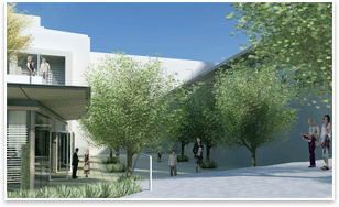
Behind the screens will be a dual-skinned system of rods (Nicola calls them “terra cotta baguettes”) and glass. This system is similar to AIA Gold Medal recipient Renzo Piano’s New York Times Building, where horizontal ceramic rods outside a glass curtain wall diffuse light and provide solar shading. The middle section of the south façade will be clad in solid terra cotta panels. From a textural standpoint, these panels and “baguettes” will match the terra cotta roof of the vaguely Spanish Mission-style Boalt Hall, though the addition’s materials will be much paler in color. From the law library complex’s south street-facing elevation, the squat profile of the South Pavilion addition also fits in as another tier in Boalt Hall’s subtly terraced massing.
|
||
Copyright 2009 The American Institute of Architects. All rights reserved. Home Page |
||
news headlines
practice
business
design
recent related
› Library of Congress Gives Hillside Bunker a New Use
› Nine Libraries Called out for Design Excellence
› Nature Finds a Way: The Berkeley Art Museum and Pacific Film Archive
Visit Ratcliff’s Web site.
Visit the Berkeley School of Law’s Renovation Web site.
From the AIA Bookstore: Building Type Basics for College and University Facilities by David Neuman, FAIA, and Stephen Kliment, FAIA (John Wiley and Sons, 2003).
Photo Captions:
All images courtesy of the architect.
1. An aerial rendering of the South Pavilion addition.
2. The glass-encased skylight section reaches down to the first basement level.
3. Screens lined with plant material give rhythm to the building’s east façade.
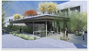
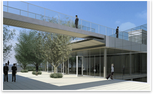
4. The glass walls of the South Pavilion addition open to courtyards.
5. Generous fenestration and monitors in interior walls allow daylight clear passage to interior spaces.

 How do you . . .
  But, through attentive material choices and thoughtful programming, Ratcliff’s design preserves these spaces as much as it can and creates new public amenities where it must, all by sitting lightly on its site and minimizing its footprint.
 Giving back green
 The evaporating building