
| Thom
Mayne’s Event Horizon Architecture Blends Natural and Constructed
Landscapes at the Perot Museum of Nature and Science In a cube on a plinth, hard questions about the nature of nature 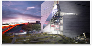
A protruding metal armature contains an escalator that leads to the museum’s primary vertical circulation corridor. Though his work is some of the most immediately recognizable of all contemporary architects, Thom Mayne, FAIA, has an ambivalent relationship with the formal qualities of his finished projects. “I’ve never had an expectation of what [it’s going to look] like, and so when it develops, I look at it myself with a certain amount of curiosity,” he says. “A lot of times the work is a bit startling to me.” Thom Mayne is hardly the first person to be startled by the work of Thom Mayne. Earlier in his career, his designs were often seen as formalistic provocations; dares that deconstructed programs, the use of materials, and basic expectations about the rationality of the built environment. The results of this approach have been buildings that bristle with such raw, unbridled energy that they seem to be barely cohesive compositions straining to organize themselves; collections of angular protrusions, raw structure, strident cantilevers, and mechanistic disruptions. Even the name of his firm, Morphosis, which he founded in Los Angeles in 1972, conjures the notion of unfinishedness and constant evolution. 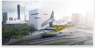
The museum’s plinth is a tectonic expression of nature and constructed landscapes. As his work became more assured and his firm more established, Mayne proved that such an architecture was suited for a much wider stage than the avant-garde design community, and he became an unlikely champion of the General Service Administration’ (GSA) Design Excellence program. With the GSA, Mayne has designed government office buildings, courthouses, and research facilities to considerable acclaim, using each new building type to refine how public buildings can best address the myths of architectural permanence, culture, and modernity. That line of inquiry continues with the Perot Museum of Nature and Science in Dallas. He sees the building, which will be Morphosis’s first museum, as an active participant in the visitor’s experience, “part of the learning process” that will blur distinctions between landscape (correlated with nature) and building (correlated with science) thought circulation patterns, materials, and form. For Mayne, a trip to the Perot Museum will be lesson in unalloyed truths about civilization and nature’s relationship in the contemporary city. Hybridized landscapes 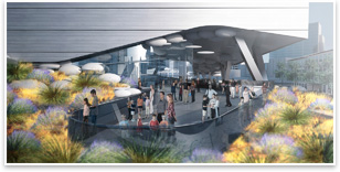
The museum cube’s entrance is tucked under the cube though glass walls. The museum experience begins as visitors enter into a civic plaza and roofscape, next to a dense landscaped forest of trees native to the East Texas plains. Along this landscaped plaza (which Morphosis is collaborating on with landscape architects Talley Associates), different sections will features various types of Texas flora. (Another mini-ecosystem will exhibit West Texas desert plants.) Visitors will explore this 1-acre landscaped ecosystem, which forms a green roof on top of the museum’s plinth where several ancillary museum programs are contained, as they head into the museum cube. From various elevation viewpoints, the plinth appears to be a piece of the earth’s crust that’s been ripped up from the earth and revealed to be partly mechanized. It’s hilly, undulating contours and carpet of fuzzy desert scrub grass express the wildness and unpredictability of nature, but the horizontally striated concrete the base is covered in is clearly a human construction. While the plinth shares this austere façade material with the museum cube, the cube’s sharp and succinct geometries amplify the abstract freedom of the plinth: pointed corners, smooth curves, and offset volumes. It’s a tectonic expression of mass and power that blurs the line between the existing constructed landscape on the street below and the newer one above, and it makes Mayne’s distinctions between the plinth and the “real ground” surreal as well as necessary. He describes it as “an archeological site where landscape is taking over the architecture. It’s part of the broader idea that the building is made out of living, changing, evolving biological material.” 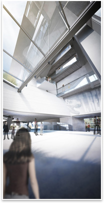
The museum’s entry atrium. But it’s not entirely clear who is taking over whom. The museum’s plinth roofscape is all about dismissing the ideal of uncompromised nature in the human realm. Apart from its holistic identity as an obviously hybridized landscape, individual landscape elements are use to illustrate this point. Some stones on the roofscape will be taken, rough hewn, from a local quarry. Other quarried rocks will be cut into long, orthogonal pieces, as “natural” as their unrefined neighbors, but bearing the mark of human intervention. Concrete blocks, similar to the façade of both the cube and plinth, will also sit on the roofscape, a symbol of inevitable and decay entropy in buildings. Mayne uses these geological riffs to point out that “all nature is now in some way manipulated by the human character. There is no such thing as the unfettered nature that’s thought of as a 19th century idea.” To enter the $185 million museum, patrons weave through and across Mayne’s self-consciously constructed landscape base (which contains the museum store, café, auditorium, and theater), further blurring the line between landscape and building. An entry plaza greets visitors under the corner and rear of the cube. A section of the cube is cut away and the glass-walled entrance is pushed back. The cube is then floated aloft by slanted structural beams that connect to an organically curving roof. From there, patrons enter the museum into a multi-storied atrium. They then ascend to the top of the museum on an escalator that’s expressed on the outside of the building with a slanting metal and glass armature that’s clipped to the cube with a heedless casualness that is a hallmark of Morphosis design. This circulation pattern (which is not the only way to experience the museum) deposits visitors in a vertical circulation corridor of stairs and glass curtain walls at the corner of the building that extends up and down its entire 170 feet. From here (and from slitted horizontal windows), visitors will get views of downtown Dallas as they wind their way through the largely rectilinear black box exhibit halls and galleries of the six level museum. Ceiling heights range from 25 to 30 feet, increasing the light and airy experience of the museum. 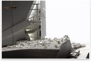
The landscaped plinth contains native quarried rocks, orthogonal-cut stone, and concrete blocks, as well as native Texas flora. This vertical circulation corridor rips back the building’s concrete façade at irregular angles to reveal dense structural lattice work and a maze of intersecting, ascending, and descending platforms. It’s a classic Morphosis moment—a view corridor that seems to have more to do with the reckless creative energy of a construction site than a staid and “finished” building composition. Looking into the guts and structure of this vertical corridor provides a surprising experience of exposure and nakedness. However, an internal logic that is all the building’s own suggests that it’s the structure that sneaks up in the viewer, not the other way around. “Leave it incomplete” This work also takes apart the myth that architecture
is about creating “permanent” or “finished” objects.
They literally recognize that, yes, even this grand museum will be
dust one day. But there’s also a metaphorical meaning that
reflects a simple fact of modernity for Mayne. As technology allows
information to travel faster and faster, time and distance are obliterated,
and cultures change, adapt, and evolve at an accelerating rate. Popular
culture fads and trends recycle themselves faster, last for less
time, and yet more people participate in them. (Imagine trying to
explain what an Internet “meme” is to a pre-broadband
human that had never heard of Microsoft.) So because Morphosis’ work
is grounded in the cultural condition they are designing in (as is
the case with all quality architecture), how can their buildings
do anything but reflect the rapid pace at which culture evolves,
devolves, and reorganizes itself? And what better way to do this
than with a design palette of refined disorder and structural evolution? It’s an event horizon architecture that acknowledges that the more things change, the faster they’ll change. Populist input The unfinished, raw aesthetic of the Perot Museum and the rest of Morphosis’ portfolio also have the added benefit of uniquely engaging the viewer and public by asking them to be an active partner in the building’s identity. These buildings sense of evolving composition cry out for visitors to help define what they are and what they will become. Every sharp angle, exposed beam, and precipitous cantilever becomes a corner of ambiguity begging for resolution in the mind of its uses. It’s a subtle way to get the public to follow along this same event horizon and give meaning to Mayne’s work. Misguided appearances of formal pretension aside, that’s as populist a plea for pubic participation in a deep-seated professional design dialectic as architecture offers. |
||
Copyright 2009 The American Institute of Architects. All rights reserved. Home Page |
||
news headlines
practice
business
design
recent related
› Morphosis Dominates 2008 GSA Design Excellence Awards
› Urban Re:Vision Competition Brings Urban Farming and Net-Zero Energy to Texas
› San Franciscos Outdoor Exploratorium Links Nature and Perception
Images courtesy of the Perot Museum of Nature and Science.
Do you know
the Architect’s Knowledge Resource?
The AIA’s resource knowledge base can connect you to a photo gallery “Silent
Collisions,” a Morphosis retrospective.
See what else the Architects Knowledge Resource has to offer for your practice.
