
| Nobody Doesn’t Like an Extra Extra Medium Summary: As a thesis project at Iowa State, Nate Klinge, Assoc. AIA, and Brad Baer, Assoc. AIA, devised a schema for conveying a corporation’s brand through the total design of a building’s operations. The architectural medium is their message, and it’s extra-extra large. As their example, the designers chose Sara Lee.
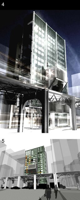
The concept they came up with is really generic, they say. “As is the case of many large-scale companies, a social façade is established to exemplify a desired image of the company to the consumer,” says Klinge. “The designer must be intimately familiar with client operations,” he says. “We were at first interested in how a façade screening system might work and how we might improve business through architecture.” “We were able to investigate how the corporation might identify itself with regard to its image,” Baer expounds. “The building form we chose was what one might typically find in Chicago, since we weren’t able to get out there to actually visit the Sara Lee headquarters.”
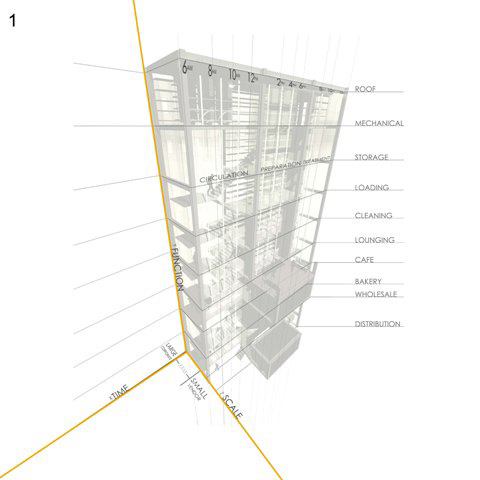
Here, from a thesis project that received an A, is the project description. Not constrained to the constituent of any one conglomerate, the marketing methodology used in this study can be applied to nearly any industry. Using the Sara Lee Corporation solely as a representative, this study examines how an architectural façade can both reveal and conceal a corporate identity. What if there were a way for a corporation to be candidly and utterly transparent to the public while accurately conveying their desired image—while bolstering sales and minimizing expenses? Could this be accomplished every day without relying on electronic media, newspapers, magazines, or billboards? Imagine the luxury of producing a quality product and allowing a single element of the architecture housing that activity to be the sole ambassador of the company’s real and desired image to the public. The design brief
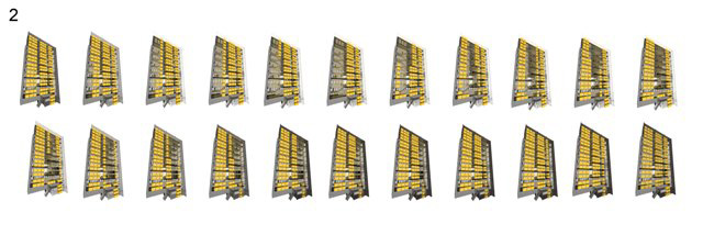
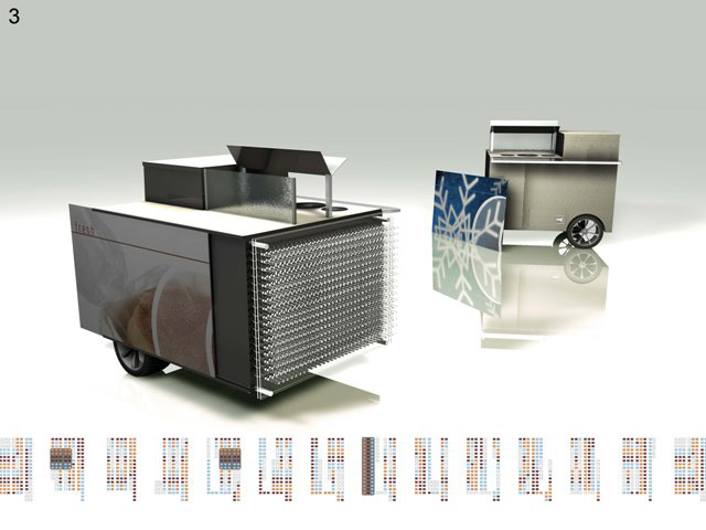
The front of the design is covered with 132 suspended Sara Lee vending carts that revolve only along the x-axis. The pattern of rotation throughout the day is such that they conceal and reveal various tasks housed within the structure at a time when it might correspond to that specific activity—cleaning, loading, cooking, etc. As the carts move among programmatic elements, they receive routine maintenance according to the function of the particular area. When a cart completes its round of programmatic elements, vendors distribute it to the street level where they sell goods to the public.
On a second level, each cart displays a portion of an image, such that when the carts align during their rotation throughout the day, a complete image is distinguishable, much like a puzzle. During the morning, noon, and evening rush hours, groupings of carts align to unveil this secondary image of a Sara Lee product. From bread to cookies, these images snap into focus at the height of customer traffic each day, while at all other times, the images are indiscernible and the façade appears pixilated. On the large scale, the carts in their entirety work together to act as a billboard, spelling out the name of the company only when the cycle completes. Between 2 a.m. and 6 a.m., the façade invites viewers to see the temporary spectacle. And the panels are interchangeable to allow adjustments for holidays or other marketing campaigns.
|
||
Copyright 2007 The American Institute of Architects. All rights reserved. Home Page |
||

out there
down here
here to there
back to earth