| NBBJ’s
Korean Museum of Animation Draws Together Public and Private Programs
with a Fluid Hand A public plaza brings the national animation museum and office complex to life
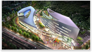
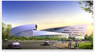
Summary: For the new headquarters of the South Korean animation industry in Bucheon, its architects at the Los Angeles office of NBBJ have created an abstract plan that creates form with fluid, organic lines. Visit NBBJ’s Web site. See what the Public Architects Knowledge Community is up to. Do you know the Architect’s Knowledge Resource? See what else the Architects Knowledge Resource has to offer for your practice. All images courtesy of NBBJ. Image 2: An arcing central plaza connects the museum and the office building. Image 3: Horizontal window bands stretch across the opaque facades of the office building. When animation studio turned media giant Disney wanted to build their own iconic presence in the American psyche, they chose to do it with broad, bold, literally representational buildings; a bit naive perhaps, but well at ease with the whimsical nature of animation. Out of a Florida swamp, Walt Disney World rose, with the cartoonishly Rococo Cinderella Castle and Epcot Center’s “Spaceship Earth” geodesic dome. Not so for the new headquarters of the South Korean animation industry in Bucheon. Its architects at the Los Angeles office of NBBJ have created an abstract plan light on literal representation that creates form with fluid, organic lines. The project’s principal in charge Robert Mankin, AIA, says the client’s sophisticated tastes demanded a building that embraced modernity with “soaring movements in form. This was responding to where that sensibility is.” Investing in animation Mankin says his intent with this museum and office complex was to create an iconic place for the centralization of an entire national industry, complete with an inviting public plaza—something like Philip Johnson’s Renaissance Center complex for General Motors in Detroit. The City of Bucheon is NBBJ’s actual client, though they will rent and lease space out to individual animation firms. The complex will serve three primary programmatic functions: a museum about the history of the Korean animation industry, a technology campus for film premiers and new content, and a networking hub where animators can use flexible office space to make deals and do business. An Eastern balance The longer, thinner building on the site contains office functions. This six-level building presents a convex edge to the public plaza, and features horizontal window bands across its opaque facades. Terraced roof gardens are slotted into its narrow profile and the top southeast corner of the building is floated over a glass curtain walled lobby and entrance space. The interiors are organized around a central circulation spine.
NBBJ’s design is meant to encourage interaction between the two buildings, despite their opposite public museum and private office programs. Beyond the linking effect of the sky bridge, Mankin says the views afforded by the terraced roof gardens will help create visual relationships between the various users of both buildings. The buildings’ primary exterior materials were originally meant to be metal panels and glass, but after construction began the City of Bucheon asked that stone be added to this mix as well.
There’s something of an Eastern Ying-Yang opposition to both these buildings’ form and programs. Private and public programs are threaded together with open public space and calligraphy-like intricacy in an equal design showcase for the miracles of the moving animated picture, as well as the business that happens behind the scenes to make it all possible. |
||
Copyright 2009 The American Institute of Architects. All rights reserved. Home Page |
||
news headlines
practice
business
design

 How do you .
. .
  The four-level museum building is wider, and offers a contrapuntal
concave edge to the courtyard. This building coils around another
terraced roof garden, terminating at a large observation window that
looks out over the city. Like the office building, the museum’s
southeast edge is also floated above a glass curtain wall. Because
most of the exhibits in the museum will be digital media and there
are few physical artifacts to be displayed, Mankin says he and his
team had much more flexibility with how they could design exhibition
spaces and how they integrated natural day lighting.
  While Mankin and his team didn’t opt for a direct representational
approach to this museum complex, they were interested in finding
a way to express the dynamic motion and excitement inherent in animation.
They chose to render this energy in abstract with buildings that
fit together like puzzle pieces. “The building needed to have
a fluidity in order to express that program,” Mankin says.