Mobile Store-in-Store Environment Designed to Captivate Shoppers
Aluminum corridor by MC2 celebrates Lacoste’s 75th anniversary, is interactive, and can be transported
by Russell Boniface
Associate Editor
 How do you . . . design a mobile, store-in-store environment that showcases a specific retail brand? How do you . . . design a mobile, store-in-store environment that showcases a specific retail brand?
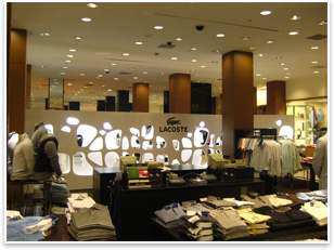
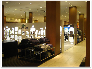
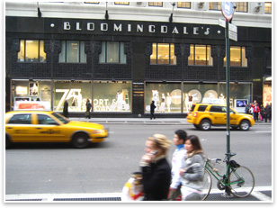
Summary: MC2, an exhibit, environment, and event producer, recently worked with sportswear retailer Lacoste on a mobile store-in-store environment to celebrate Lacoste’s 75th anniversary. The 30x12x8-foot space is an aluminum corridor of mirrored plexiglass in various white-gloss patterns with cut-outs resembling crocodile skin that reflect the store’s crocodile logo. Store founder and tennis legend René Lacoste was the first to put a logo—the crocodile—on a polo shirt. The aluminum corridor was showcased at Bloomingdale’s flagship store in New York City this past summer and is awaiting its next venue.
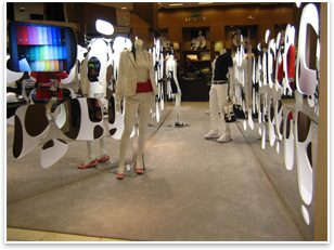
 The Lacoste exhibit is designed to be mobile and appear at other retail venues. The aluminum corridor features mirrors and white-gloss plexiglass patterns on both the internal walls and external walls, some with cut-outs unique in size and shape. The plexiglass cut-outs allow customers to view the inside of the Lacoste environment from the outside. The Lacoste exhibit is designed to be mobile and appear at other retail venues. The aluminum corridor features mirrors and white-gloss plexiglass patterns on both the internal walls and external walls, some with cut-outs unique in size and shape. The plexiglass cut-outs allow customers to view the inside of the Lacoste environment from the outside.
“The challenge was to take the Lacoste two-dimensional concept and turn it into a three-dimensional reality that tells their story,” explains Chris Ross-Williams, senior account director at MC2. “We created a hollow environment, and the cut-outs allow people to see through. The crocodile skin plexiglass pattern became the pattern. Each is different on both sides. In terms of the other branding elements, one side of the corridor focuses on the past, which represent René Lacoste, his tennis achievements, his innovation of the first Lacoste shirt, and as designer of the first metal racket. On the other side, it represents the Lacoste brand in the present and its 75th anniversary product line. The structure is designed to be interactive.” There are also life-size images with cut-out patterns of Lacoste and of current brand ambassador Andy Roddick.
 No visible means of support No visible means of support
To allow the corridor to be seen from the outside, no support beams are visible from any angle. The design also had to be sturdy enough to make the structure easy to dismantle, transport, and reassemble. “The aluminum frame approach eliminated the need for cross-bracing, which would have got in the way of the crocodile cut-outs and make it look cluttered, losing the effect. The aluminum structure lends support to the cladding,” Ross-Williams says. “Mirrors on the cladding and the patterns are put firmly into place so as not to slip when transported. Once we worked that out, it gave the desired effect and worked very well.”
As the white gloss surface maximizes the effect of the crocodile cut-outs, LCD screens, built into each end of the structure, showcase a video loop about the Lacoste brand. “The aluminum corridor at Bloomingdale’s served as a backdrop to a public relations event celebrating Lacoste's 75th anniversary. People could play tennis against a wall, and meet Andy Roddick.”
 Ross-Williams says that these in-store, mobile environments are becoming more popular. “Environments like Bloomingdales can be cluttered, because they are competitive,” he points out. “Creating a store-in-store environment lends itself very well to any specific one brand and creates a captive environment and captive audience, where specific brands and products can be showcased in a concise way. It will attract and retain the attention of any specific in-store traffic.” Ross-Williams says that these in-store, mobile environments are becoming more popular. “Environments like Bloomingdales can be cluttered, because they are competitive,” he points out. “Creating a store-in-store environment lends itself very well to any specific one brand and creates a captive environment and captive audience, where specific brands and products can be showcased in a concise way. It will attract and retain the attention of any specific in-store traffic.”
The aluminum corridor is currently in a storage facility waiting its next deployment, a Lacoste store in Buenos Aires, then to other Lacoste stores in North and South America throughout 2008.
| 


