Medical Center Brings the Outside Indoors
Fairview Maple Grove Medical Center highlights views, wayfinding, staff interaction
by Russell Boniface
Associate Editor
 How do you . . . design a medical center that ties into the natural landscape? How do you . . . design a medical center that ties into the natural landscape?
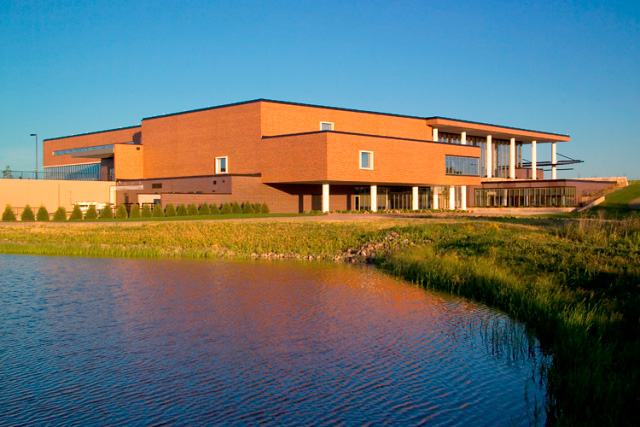
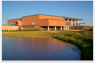
Summary: The 138,000-square-foot Fairview Maple Grove Medical Center in Minnesota, a partnership between University of Minnesota, University of Minnesota Physicians, and Fairview Health Services, designed by HGA Architects and Engineers, recently opened its doors to the public. HGA’s design strives to connect the indoor and outdoor environment for patient healing, maximize wayfinding, and encourage staff interaction.
 The three-story center, which features a brick, steel, and curtain-wall exterior, sits on a site that slopes down into a wetland and woodland area, part of the Elm Creek Park Reserve. The three-story center, which features a brick, steel, and curtain-wall exterior, sits on a site that slopes down into a wetland and woodland area, part of the Elm Creek Park Reserve.
Views bring nature inside
“We wanted to preserve that edge of the site and focus the building with views,” says Dan Polachek, AIA, senior design architect. “That oriented the main circulation spine of the building in an east-west direction, with two large program clinic blocks that skew about five degrees from each other, so the views open up gently. It frames views of the ponds from many parts of the building. We also created stormwater retention behind those ponds.”
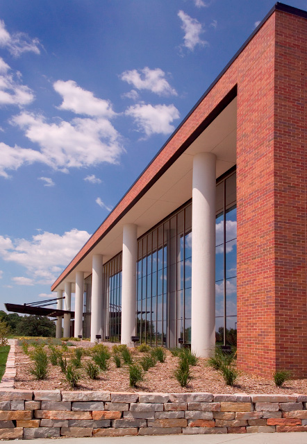
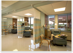
The curtain-wall skin enabled the design to take advantage of the views of the preserve and maximize natural light for patients. “We used a high-performance glass that has minimal reflectivity. You can see into it when you need to. Yet some areas of the building are treatment areas for people with cancer, for example, who are sitting right behind the glass and don’t want to be seen,” Polachek explains. “So, reflectivity in the glass means that in daytime you can’t see them behind the glass. The reflective glass also helps us deal with heat gain in the summer and heat loss in the winter.”
 Atrium as the spine Atrium as the spine
A two-story transparent atrium serves as the spine and entrance to the building. There are visible staircases for easy wayfinding to exam rooms, clinics, therapy rooms, imaging areas, and offices. The different destinations are stacked and grouped in pods off of the atrium space. “The spine is the circulation core and helps people maintain their bearings,” Polachek explains. “They come out of their clinic and they see the preserve. It gives a sense of openness. It’s not a big box or a battleship that some health-care faculties end up looking like. It makes people feel comfortable to know they are not lost. Also, by creating that space, it’s much easier to see where you’re going to end up. Your destinations are straight shots from wherever you are looking as you enter the building.”
Gary Nyberg, HGA principal, says the groupings, or pods, make the journey to the check-in location quicker since it’s an open environment. “Once you get up to a waiting area that serves a particular pod, the distance from that waiting area to the exam area is minimized,” he says. “The journey may be the same distance, but the feeling is that it’s less because most of it is conducted in an open space.”
Promoting staff interaction
Toward the back of the pods is an off-stage area that allows staff to interact. “At the back of each of these program blocks are separate corridors for the staff so they can go from clinic to clinic without having to go out into the public areas,” explains Polachek. “On the lower level down at the water side we grouped all the education, conference, and dining spaces in private glass areas off the water, protected from the wind.”
 Building materials Building materials
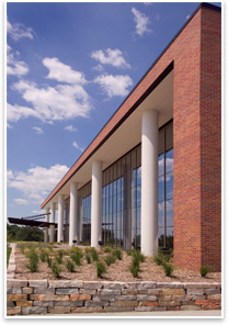
Polachek notes the approach for the exterior materials was twofold. “One, to blend in with surrounding reddish brick buildings, while being a cornerstone. Second, to match the brick used at the University of Minnesota campus. This facility has a lot of practicing physicians from the university. We also used a lot of multistory white columns. The combination carries the look from the campus to this site.”
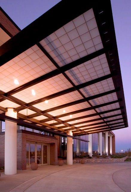
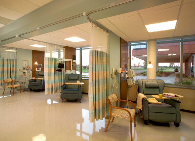
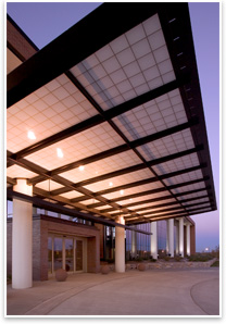
Natural limestone stone walls, with a range of colors, are used to help anchor the building into the sloped site. An entrance overhang with aluminum sunshades is in place to offset heat gain. Inside, the design softens the interior and connects with the natural environment. In addition to views to the wetlands and woodlands, the design features natural stone, maple wood trim, warm cream-colored tile, wood ceiling panels, and artwork that draws its context from the wetlands.
 “In some cases we used bolder colors,” Nyberg says. “The colors were successful because there was a lot of natural light bathing the public space. We used carpeted corridors in the exam areas for a quiet, private environment.” The center has a pediatric clinic staffed by university physicians who wanted innovative materials, says Polachek. “We used glass that has [etched] cattails as part of the entryway and have lights that look like insects.” “In some cases we used bolder colors,” Nyberg says. “The colors were successful because there was a lot of natural light bathing the public space. We used carpeted corridors in the exam areas for a quiet, private environment.” The center has a pediatric clinic staffed by university physicians who wanted innovative materials, says Polachek. “We used glass that has [etched] cattails as part of the entryway and have lights that look like insects.”
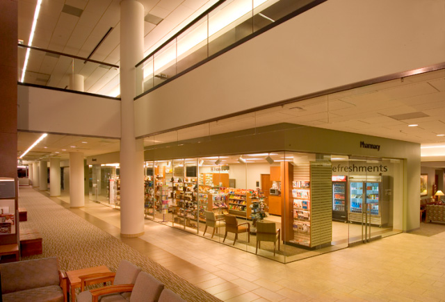
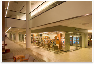
A glass-enclosed pharmacy on the first floor provides one-stop shopping, and kiosks inside each entry notify staff of patient arrival, eliminating the need for paperwork. Rounding out the design are its sustainable features, which include energy-saving motors for HVAC equipment, energy-efficient chillers, and low-water plumbing fixtures.
|