University
of Kansas Hospital Cancer Center Takes a Personal Design Approach
by Russell Boniface
Associate Editor
 How do you . . . take a non-traditional approach to clinical design
that gives patients dignity and comfort? How do you . . . take a non-traditional approach to clinical design
that gives patients dignity and comfort?
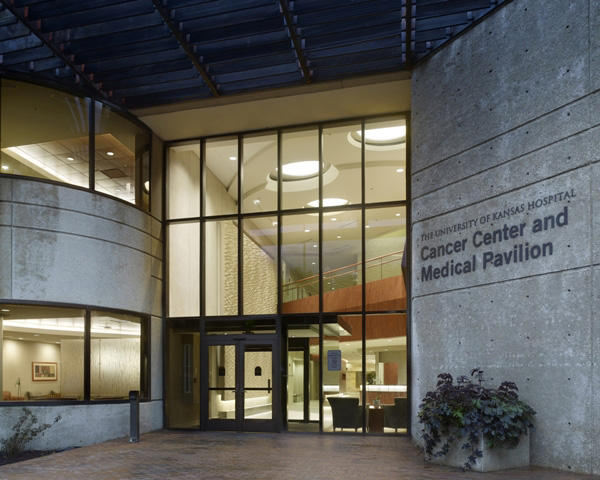
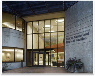
Summary: The University of Kansas Hospital in Kansas City, Kans., has opened its new $25-million outpatient cancer center, designed by RTKL Associates Inc. (which since has merged with ARCADIS). The three-story, 138,000-square-foot center adaptively reuses a 1950s-era office building. To meet the overall goal of making patients, their families, and visitors as comfortable as possible, the architects provided a personal, soothing environment, replete with warm earth tones, large windows, private treatment areas with comfortable high-end lounges and changing rooms, light wood finishes, and wall art. Wayfinding is enhanced by siting the center away from the main hospital campus for easy access to the drop-off area. Also to aid in wayfinding, the building itself has a wide, three-level stacked concourse.
 The University of Kansas Hospital’s Cancer Center and Medical
Pavilion provides treatment services from early cancer detection
through survivorship. To make more room for these treatment services
to accommodate increased growth in the program, the University of
Kansas Hospital chose to relocate the cancer center to an expanded
space on its campus. The University of Kansas Hospital’s Cancer Center and Medical
Pavilion provides treatment services from early cancer detection
through survivorship. To make more room for these treatment services
to accommodate increased growth in the program, the University of
Kansas Hospital chose to relocate the cancer center to an expanded
space on its campus.
Incorporating increased wayfinding, earth tones
The 1950s-era, precast concrete office building had recently served
as the national headquarters for Sprint. To convert it to a cancer
center, the design team eviscerated the three-story, precast building,
leaving only the structure and skin; replaced the mechanical systems;
and changed in a new elevator core. “The scale of the existing
building gave the new cancer center a human, pedestrian scale,” says
Patrick McCurdy, AIA, principal at RTKL Associates. “The
first floor is somewhat recessed into the sloped ground on a heavily
landscaped site. The approach from the street to the public drop-off
is a nice approach, plus locating the facility from the main campus
provides more direct access to the door entrance. There’s
no more walking from a garage, across a bridge, and through the
hospital. Circulation and wayfinding has been greatly improved.”
McCurdy says that the site lends itself to bringing a large amount
of natural light into the building. He also felt it was important
to maintain the earth-tone colors of the original building for the
new cancer center. “We wanted to keep that spa feel, both for
the interior and exterior, and have them both relate.”
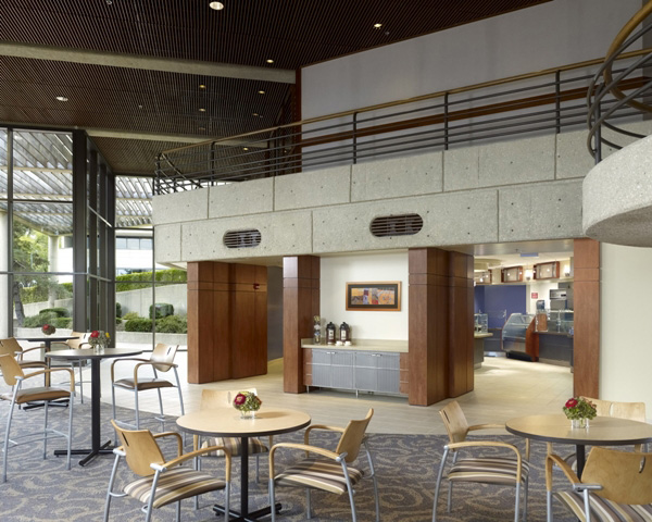
 The interior of the three-level cancer center blends muted earth
tones, natural and indirect light, art, and wide concourses to make
for a soft, pedestrian-friendly facility. “We tried to promote
through the design a soothing, healing environment away from the
traditional clinical feel.” McCurdy says. “There is a
main concourse, similar to a mall setting, with places to be seated
and artwork hanging on the walls. A two-story volume space in the
main entrance has an art wall that resembles flowing water and blowing
sand to create a timeless feeling. We stacked the concourses, and
at the end of each one is a bright area of entrances.” The interior of the three-level cancer center blends muted earth
tones, natural and indirect light, art, and wide concourses to make
for a soft, pedestrian-friendly facility. “We tried to promote
through the design a soothing, healing environment away from the
traditional clinical feel.” McCurdy says. “There is a
main concourse, similar to a mall setting, with places to be seated
and artwork hanging on the walls. A two-story volume space in the
main entrance has an art wall that resembles flowing water and blowing
sand to create a timeless feeling. We stacked the concourses, and
at the end of each one is a bright area of entrances.”
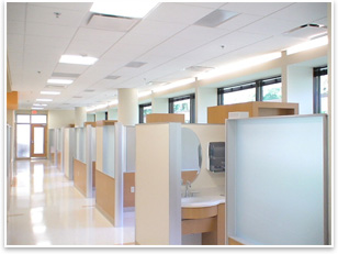
For wayfinding, McCurdy points out, one goes from the concourse
directly into a waiting room of one of the clinics. “There’s
no ‘down the hall, turn to the right,’” he explains.
In addition, areas along the wide concourses are broken down into
different zones, where patients can be seated, look at artwork, and
relax.
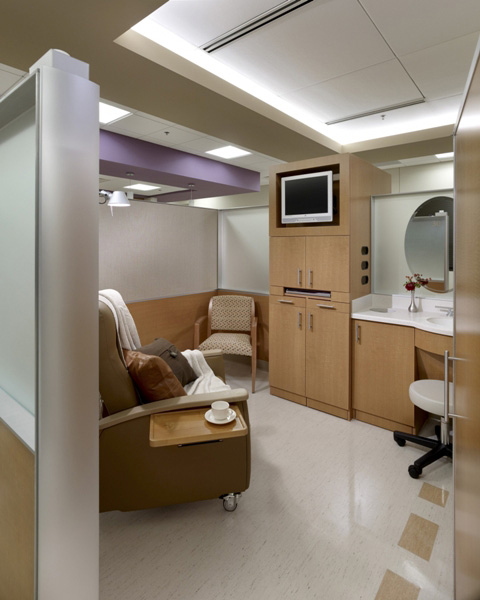
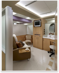
Treatment areas give patients comfort, control
Making treatment areas, lounges, and even changing rooms as comfortable
as possible for patients was paramount to McCurdy. “The level
and detail of the design addresses dignity and personalization
within a total composition.” An example, he describes, is
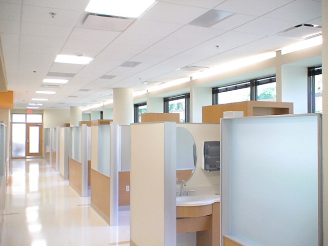
the changing rooms in the radiology areas, with backlit mirrors,
indirect lighting, upgraded wall fabric, and an actual door as
opposed to a curtain. “The changing rooms resemble what you
see at a high-end clothing store, not a typical hospital,” he
says.
 The architect placed the treatment areas on the building’s “treetop
level,” so called because patients look out the large windows
to the treetops beyond. Treatment bays conceal medical equipment
into the casework for a non-clinical appearance, with countertops
and faucets that look residential. The treatment areas incorporate
translucent, custom-made dividers so natural light can flows through
the space. “We wanted to get away from the chair-by-chair,
cubicle curtain or walls,” says McCurdy. “Now, even the
treatment bays in from the window still get light through the ceiling
space above and through the translucent dividers” The architect placed the treatment areas on the building’s “treetop
level,” so called because patients look out the large windows
to the treetops beyond. Treatment bays conceal medical equipment
into the casework for a non-clinical appearance, with countertops
and faucets that look residential. The treatment areas incorporate
translucent, custom-made dividers so natural light can flows through
the space. “We wanted to get away from the chair-by-chair,
cubicle curtain or walls,” says McCurdy. “Now, even the
treatment bays in from the window still get light through the ceiling
space above and through the translucent dividers”
The combination of warm, incandescent lighting with natural light
was also critical, McCurdy states. “The entire facility has
warm lighting, so when patients look in the mirror, their coloration
is not getting flushed out. They are already pallid because their
bodies are going through this difficult time. We wanted the light
level to give them color in their skin so that they look healthy
when they look in the mirror.”
Another key element in the design composition was allowing patients
to control the comforts in the treatment areas. “They are not
in control of their bodies right now. In the treatment areas they
can control the lighting in their space, the recliner, DVDs connected
to a flat screen panel, and speaker volumes. We do anything we can
to give them complete control of their environment,” McCurdy says.
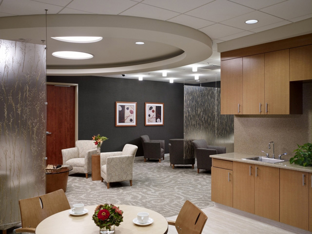
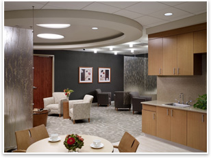
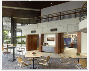
 Upscale lounges lets patients, family relax Upscale lounges lets patients, family relax
The design includes a family-patient lounge in the treatment bays. “Patients
can take their IV poles, leave the treatment bay, and go to a corner
where all the glass views directly out. There is a TV and upscale
break area where they can get coffee and ice. Patients can sit down
with family to get away. Or the family member can get away,” McCurdy says. The
design also provides a visitor-family lounge for the entire facility,
located in the clinical area. “It’s what we call an airline
members’ club. It has higher-end fabric on the chairs and wall
coverings, granite countertops, upper-scale cabinetry. We cut openings
through the existing pre-cast concrete to allow views out to the
garden. A family member can be there over four hours, so here they
can get away, get on to the computer, grab a snack, and sit down
in a club chair … just to escape for a little while.”
McCurdy notes that the facility resembles more of a boutique hotel
rather than a medical facility. “We’ve heard a lot of
feedback already from staff, visitors, and patients who are saying
it does not feel like a hospital.” |