
U+B Architecture Designs Award-Winning Space on a Modest Budget by Cynthia Young
Summary: When Minneapolis advertising firm Kruskopf Coontz was looking for new office space, Principal Sue Kruskopf wanted the space to convey a softer image than the heavy-timbered, exposed-beam, masculine look of some ad agencies. Located in the Flour Exchange Building in the vibrant riverside area, Kruskopf collaborated with Minneapolis-based U+B Architecture & Design to create a modern, open, simple space that was filled with natural light and infused with soft blues, greens, and pale yellows that give it a leading-edge, yet playful feeling.
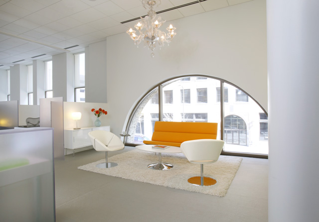
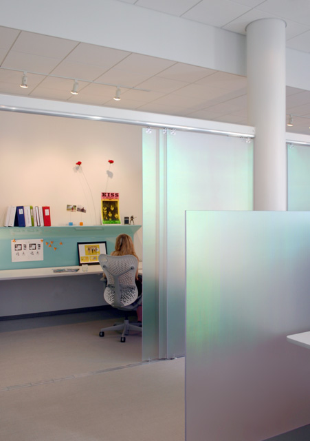
U+B Architecture, led by Principals Mark Burgess, AIA, and Paul Udris, AIA, and Project Manager Eric Ludwig, created a cohesive design that incorporated a variety of work environments, including open and closed offices, creative work areas, lounges, and a presentation room. The office also has large exterior windows that infuse the space throughout with natural light. Light as a metaphor
To create a theme that runs through the entire project, the architects created translucent walls using semi-opaque resin panels manufactured by 3form, a material that resembles sharkskin. The iridescent surface of the milky white panels bounces light across the space. The panels serve as sliding partitions, privacy walls between offices, kitchen cabinets, sidelights for principals’ offices, and for the entrance reception desk. As light hits the panels, they glimmer and change colors from soft turquoises and greens to pinks and yellows. As the light changes across their surface it evokes a playful feeling. “This is all about transparency, about how light moves through the space. It is also a metaphor for the advertising agency,” says Ludwig. “Clients walking through the space can see how the work gets done. You get the sense that it is an extension of their work philosophy, which is open and collaborative. They have privacy when they need it, but the design also allows light to pass through.”
When clients visit, to reach the conference room, they walk through the space and past a row of work stations to the presentation room at the end of the office. “We liked what the office presented in terms of the procession through the space,” notes Burgess. “We purposely chose to put the pitch room at the end of the office. We wanted to bring the clients through the space to show the vitality of the work process. The space lent itself to that.” “Modern and fresh”
The architects also designed the space within the client’s budget of $65 per square foot. For impact, U+B coupled the higher-priced panel material and higher-end furniture pieces with moderately priced Ikea furniture. “The space is serious, but it is also fun,” concludes Ludwig. |
||
Copyright 2007 The American Institute of Architects. All rights reserved. Home Page |
||


home
news headlines
practice
business
design
recent related
› BHM Designs Its Own New Headquarters Green
› Open Plan Invites People, Sunlight, and Riverside Cityscapes into AIA Chicago’s New Offices
Photo by John Christenson and William Dohman.
Visit the AIA’s Small Project Practitioners online.