Interior Architects Help Seattle Credit Union Embrace Change
Architecture and design process reflect company culture
by Tracy Ostroff
Contributing Editor
 Summary: The architect and design process of Interior Architects (IA) reflects the culture of flexibility and teamwork that is the hallmark of the Watermark Credit Union, a member-owned, not-for-profit financial institution that has been doing business in Seattle for more than four generations. A six-month study of Watermark’s space and work styles, stewarded by an employee committee that help set priorities for the six-story, 40,000-square-foot project, led to an open plan built from a kit of parts consisting of common systems and freestanding furniture components. There are just two fixed offices (for the heads of human resources and internal audit). Summary: The architect and design process of Interior Architects (IA) reflects the culture of flexibility and teamwork that is the hallmark of the Watermark Credit Union, a member-owned, not-for-profit financial institution that has been doing business in Seattle for more than four generations. A six-month study of Watermark’s space and work styles, stewarded by an employee committee that help set priorities for the six-story, 40,000-square-foot project, led to an open plan built from a kit of parts consisting of common systems and freestanding furniture components. There are just two fixed offices (for the heads of human resources and internal audit).
How do you … work by committee to create a great space?
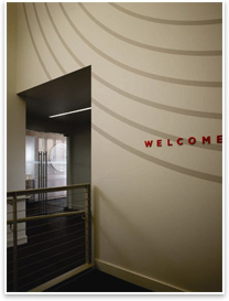
 The storefront office space is in an historic 1929 building less than a block away from Watermark’s previous downtown location. IA Senior Associate Mark Gribbons says the planners wanted a “window into the organization.” The storefront locale, with a break area that fronts to the main street, provides that prism into the inner workings of the credit union, including accounting, administration, human resources, information technology, lending, marketing, and a customer-service call center. The storefront office space is in an historic 1929 building less than a block away from Watermark’s previous downtown location. IA Senior Associate Mark Gribbons says the planners wanted a “window into the organization.” The storefront locale, with a break area that fronts to the main street, provides that prism into the inner workings of the credit union, including accounting, administration, human resources, information technology, lending, marketing, and a customer-service call center.
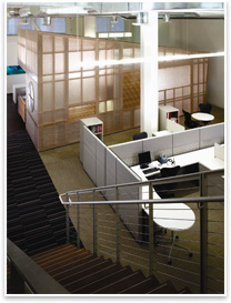
Watermark’s core values are flexibility and teamwork. The open plan accommodates at least 10 percent staff growth without electrical or mechanical system modifications. As additional workstations become necessary, work surfaces and personal storage units along the furniture spine can be redistributed, effectively reducing each workspace by four square feet. All conference rooms are set to a common module for easy conversion to alternate uses.
In all, the site is an employee retention tool for the members of the staff who delight in the interior architecture; a symbol of the organization’s commitment to their community and how their actions ripple through it; and an employment ad for those they hope to bring in the fold with their hip, new building that reflects their work ethos and raison d'être.
 By the employees and for the employees By the employees and for the employees
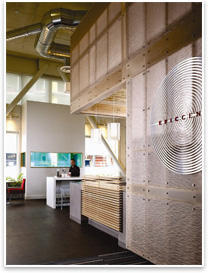
The heart of the building and a key design element is the break area, named the “Epic Center.” Its main feature is a freestanding pavilion within the two-story space. The pavilion is wrapped in recycled plastic panels embossed with Watermark’s signature water ripple pattern. Light images and messages are projected on the pavilion walls from inside. Functionally, the pavilion serves as a staff coffee bar and Internet café. Among the eco-friendly features is a coffee bar made of concrete surfacing, a seating area platform finished with low-VOC bamboo strandboard, and wood flooring fabricated from scrap lumber gathered locally.
The initial study gave members of the organization an “opportunity to define themselves, their ideals, and to forecast long-term growth,” Gribbons says. Once the programming started, the CEO was kept informed, but decidedly kept himself at a distance to give employees the opportunity to speak freely without executive oversight. It also streamlined the process and helped the group move quickly to make decisions. The core group helped determine future needs, design criteria for the aesthetic, and furnishings and fixtures.
The notion is that an employee-driven process leads to employee attraction and retention. Equally as important is the commitment of the organization’s leadership to the process and to defending employee decisions. Gribbons enthuses about the process: “If you are going to make sure the facility operates effectively, who better to develop the design criteria than the people who work there?” IA is embarking on this employer-driven process more often and on larger scales, he says. For example, IA has a project in the works for the online travel company, Expedia Inc., where the employee committee will reflect 20 percent of the company workforce.
 Youthful design attitude Youthful design attitude
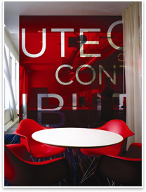
“For every loan they make, there is a ripple effect through the community,” and the design of concentric circles recollects that charge,” says Gribbons. The logo is repeated in the building to add color and graphic interest. The company’s vibrant red is infused carefully and strategically to bolster the brand and the design.
Gribbons says the designers asked how they could “go about inspiring employees and informing them in the course of their work every day.” A glass wall collaged with words that reflect the key values of the organization are set to motivate and inspire. The designers and graphic artists chose this approach rather than the traditional billboard mission statement-style enforcement found in other meeting and board rooms.
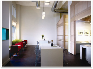
This integrated plant life is in line with the design team’s sustainability efforts for the project. Gustafson Guthrie Nichols collaborated with IA on a planting scheme within the street-level windows of the break area. Native ferns were selected for their soothing, low maintenance, and hypoallergenic features. “In a fitness-driven city flanked by two major mountain ranges, bringing a bit of the wilderness to work is a real attraction. You can find staff sitting among the ferns most any time of day,” explains Gribbons.
 Don’t call it a bank Don’t call it a bank
Watermark’s distinction as a nonprofit institution was an important one to facility planners. Staff members pride themselves on careful stewardship of member resources and on maximizing profit and return for credit union members. In keeping with these ideals, they declined to spend money on private offices. The design also eschews many of the trappings of status and stature that one would see in a for-profit organization, Gribbons says. Rather than move into a new building, they decided to buy an historic building and to make an investment in their community by bringing it up to the standards of Class A office space.
Also, instead of pursuing LEED® certification, Gribbons says they pursued green strategies, but the money that they would have spent on certification was directed back to employee benefits.
“If eliminating executive offices is controversial, you never would have known it at Watermark Credit Union,” says Chuck Cockburn, Watermark president and CEO, in a press release. “We asked ourselves many tough questions during the design process and our litmus test was simple: If it fit with our culture, we found a way to make it happen.” |