RMJM-Hillier’s “Merjer” of Graphics and Architecture
Design studio makes cities readable and buildings navigable
by Zach Mortice
Associate Editor
 Summary: Merje is RMJM-Hillier’s environmental graphic design studio. It is an independent entity that works on RMJM-Hillier projects and on external projects. For both their public and private clients, Merje sees their work as being most analogous to marketing. Since the cross-continental merger of architecture firms RMJM and Hillier last year, Hillier’s former graphic and environmental design studio has been the beneficiary of some of their own rebranding efforts. It’s been relaunched as Merje, a six-person independent studio within RMJM-Hillier, based out of their Philadelphia office. Summary: Merje is RMJM-Hillier’s environmental graphic design studio. It is an independent entity that works on RMJM-Hillier projects and on external projects. For both their public and private clients, Merje sees their work as being most analogous to marketing. Since the cross-continental merger of architecture firms RMJM and Hillier last year, Hillier’s former graphic and environmental design studio has been the beneficiary of some of their own rebranding efforts. It’s been relaunched as Merje, a six-person independent studio within RMJM-Hillier, based out of their Philadelphia office.
How do you ... design interiors and graphics for diverse public and private clients?
 Merje (which “merges” graphics with the built environment) creates signage, branding graphics, and interiors for individual buildings as well as entire urban districts. Their clients come from a range of private and public institutions, from various cities (Dallas; Camden, N.J.; Miami Beach, Fla.), to private companies (Philadelphia’s CBS affiliate), to civic buildings (the Virginia State Capitol). Merje (which “merges” graphics with the built environment) creates signage, branding graphics, and interiors for individual buildings as well as entire urban districts. Their clients come from a range of private and public institutions, from various cities (Dallas; Camden, N.J.; Miami Beach, Fla.), to private companies (Philadelphia’s CBS affiliate), to civic buildings (the Virginia State Capitol).
On any project, studio director John Bosio says Merje’s work is more akin to marketing than to architecture or urban planning.
“The projects we do are marketing projects,” he says. “It adds another layer of information that really promotes the client, their brand, or image that they’re trying to portray. There is another layer of information that is integrated into the building that not only functions from a wayfinding standpoint, but begins to tell a story, whether it’s literal or subliminal.”
Identity for others
Bosio’s studio was originally part of Hillier, but for the past 15 years, they’ve been collaborating on other projects as well. Now, they do more work outside of RMJM-Hillier. The merger with RMJM, Bosio says, has given Merje more of an international presence, and the subsequent reorganization and new name has solidified the studio’s place as an independent entity. “[Clients] aren’t hiring RMJM-Hillier,” he says. “They’re hiring Merje.”
 As opposed to an architecture or design firm that sells its clients an independent, autonomous interpretation of a project, Bosio sees himself working in “an industry that creates identities for others.” Merje draws upon architecture and the built environment to create marketing materials. Other architects use architecture in and of itself as marketing. As opposed to an architecture or design firm that sells its clients an independent, autonomous interpretation of a project, Bosio sees himself working in “an industry that creates identities for others.” Merje draws upon architecture and the built environment to create marketing materials. Other architects use architecture in and of itself as marketing.
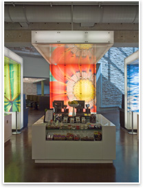
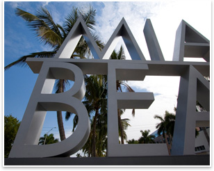
With some projects, Merje relies on existing building stock to inform a project, as with their Art Deco-infused Miami Beach Architectural Historic District signage project. In their work for medical technology company Becton Dickinson, they created an aesthetic palette of thematic imagery consisting of earthy-green color tones and photographic nature imagery, all meant to convey organic and eco-friendly values. Other times, they’ve created logos based on an adopted symbol, like their work in downtown Dallas’s business district, symbolized by a Pegasus that appears on the project’s new signage and wayfinding systems.
Merje’s work is often consistent in scale and configuration to meet legibility requirements, but their style and aesthetic isn’t developed formulaically. Bosio says that they’re trying to capture the character of the places they’re designing for.
Capturing and executing
To capture the character of Miami Beach for a city-wide signage and wayfinding project, Merje (then a part of Hillier) organized what they called an “Identity Forum” workshop. They called together city commissioners, members of design review boards, and the community at large to sort through materials, logos, images, and lists of words. Merje asked these people to select pieces that they felt represented the image Miami Beach wanted to convey. Merje used these pieces as creative feedstock for what would ultimately become their crisp, Modern signage project.
 Miami Beach principal planner Joyce Meyers says this process worked on two fronts. “It gave the people of Miami Beach who are really interested in that a chance to participate, and it gave Hillier an insight that they may not have been able to have if they were just interviewing people or coming up with ideas on their own,” she says. Miami Beach principal planner Joyce Meyers says this process worked on two fronts. “It gave the people of Miami Beach who are really interested in that a chance to participate, and it gave Hillier an insight that they may not have been able to have if they were just interviewing people or coming up with ideas on their own,” she says.
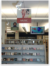
For the Princeton Public Library in Princeton, N.J., Merje designed exterior and interior signage, and an overall rebranding effort. The client asked the design studio to create a retail-like atmosphere at the library. Merje responded with a colorful design that features stock photos illustrating library uses and sections that had “a sense of playfulness about [them],” says library director Leslie Burger.
The text-light design is a far cry from the grand and imposing civic icon that libraries became in the Beaux Arts design tradition. “The idea that we can use text and images to guide people where we’re trying to get them is a good way to do that,” says Burger. “I think it appeals both to people who are text-based learners and visual learners.”
 Integration into projects: existing vs. new Integration into projects: existing vs. new
In varying circumstances, Merje is hired to add graphics and signage to projects that have already been built, but they also work on graphics and interiors along with building architects for entirely new projects. Bosio says an advantage of completely new projects is that the process is more flexible, as Merje and the architects they’re working with can adjust to each other as the project moves forward. When adding interiors and graphics to existing buildings, there is often less team integration, and the design process is more limited and fixed, as the building materials and form have already been established. But, with existing projects, “You can walk through,” says Bosio. “You can see how people are using the building. It’s right in front of you.”
And, hopefully, after Merje’s work, it’s even more obvious to the visitor. Merje’s job is to make buildings and cities more legible, one graphic at a time. “If someone visits a city and it’s easy to find their way around, they’re more likely to come back,” says Bosio. |


 Summary: