Designing a Contemporary Art Museum While Honoring the Past by Cynthia Young
Summary: To showcase and preserve its distinctive collection of art, Massachusetts’ Provincetown Art Association & Museum (PAAM), housed for years in a 19th-century sea captain’s home and in a hodgepodge of additions, needed desperately to expand. Boston-based Machado and Silvetti Associates designed a contemporary structure that incorporates the architectural elements and textures of the pitched-roof, wood-shingle, Federal-style houses in this longtime art colony to create a competitive art museum that can partner with big-city museums while nurturing the work of esteemed Provincetown artists. In additional to earning several prestigious design awards, PAAM is the first LEED® certified art museum in the country.
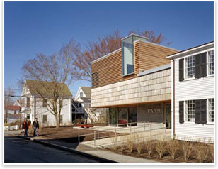
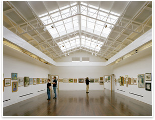
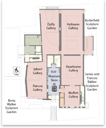
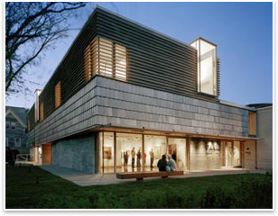
“People can see things happening inside the museum,” says Christine McCarthy, PAAM executive director, of the Patrons and Ned Jalbert Gallery, one of five galleries in the museum. “They can see the artwork; it looks like a museum. We now have a Federal-style house coupled with a contemporary structure—the museum has solved its identity crisis.” Unique context Rather than compose the new addition in a single volume, the team designed the exterior in three horizontal bands to break it down and reduce the appearance of scale. The lowest band, at street-level, consists of a framework of board-formed concrete, imprinted with the grain of wood in the material. Above, a second horizontal band of oversized shingles overhangs the first level, linking it upward to the third band of horizontal louvers, which wraps around the second story. Both shingles and louvers are made of Spanish Cedar, which has weathered to gray. On the second story, two large windows project out from the roofline, much like widow’s walks on the town’s historic rooftops. Situated above the main entrance and the side entrance to the art school, the glass lanterns illuminate the doors for the museum’s two principal functions.
Winning over the public The team’s requirements were to increase gallery and storage space, give a sense of continuity and flow among the galleries, allow individual and collective art exhibits, and provide climate control for humidity, cooling, and heating. To allow the association to keep exhibits open, construction was phased in over two years, starting with the complete renovation of the older building in 2004, then the demolition of three buildings, and construction of the new addition in 2005–2006.
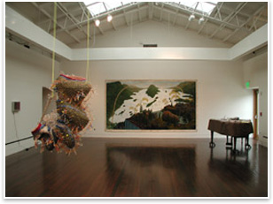
Windows were carefully placed to align with openings into galleries or exterior views that afford a strong connection to the natural elements and the sea. Skylights infuse the older galleries with natural light, and north-facing skylights illuminate the second-story studio classrooms. “Whether it is a gray or a sunny day, the light is beautiful,” says McCarthy. A daylight dimming system in the galleries also saves energy and supplements natural light when needed. The museum is also the first certified LEED® Silver art museum in the country. Its energy efficiency is expected to save the museum $12,000 annually in energy costs. The team designed a tight building with a thermally efficient skin containing added insulation and high-performance windows. Thus, the building can resist the variations of temperature and humidity in a coastal environment. Photovoltaic panels on the roof’s south side capture solar energy. The team used recycled, natural, and local materials wherever possible throughout the project. The building also has a natural ventilation system that, when exterior conditions and the curators permit, pulls in 100 percent outside air to condition the building.
And art-lovers are responding. The museum is receiving more gifts to their collection, more partnerships with museums, and a strong interest in downloading exhibition podcasts. “It is better than we could have imagined,” McCarthy says. “I still get goose bumps when I walk in. It has come full circle—it is a beautiful space.”
|
||
Copyright 2007 The American Institute of Architects. All rights reserved. Home Page |
||
The five-member architecture team was led by Project Architect Andrew Cruse, AIA, LEED-AP, with Principal-in-Charge Jorge Silvetti, Consulting Principal Rodolfo Machado, Associate-in-Charge Michael LeBlanc, and project team members Kelly Smith, Derek Johnson, John Clegg, and Chris Grimley. The renovation contractor was Paul J. Rogan Co. of Braintree, Mass.; new construction contractor was Acella Construction of Norwell, Mass.; and energy consultant was DMI of Newton, Mass.
PAAM received a 2006 Merit Award for Design Excellence from AIA New England, an Honorable Mention from the 2007 AIA COTE Top Ten Green Project Awards, and a Green Pioneer Award for a National LEED® Milestone from the alternative transportation and energy festival, AltWheels.
Visit the AIA Committee on the Environment online for more information about sustainability issues.

 How do you . . .