
best
practices Summary: In his newly released Writing for Design Professionals, 2nd ed., Stephen A. Kliment, FAIA, describes every imaginable type of A/E communications, including a section on creating an effective Web presence. In his concluding chapter, excerpted here, he describes how to measure the impact of that work, including the “fog index” of your writing.
Managers in each of these groups should commit regularly—once a year at least—to monitoring their communication program. Do this by gathering representative samples of your entire printed and on-line output. Then subject each item to rigorous evaluation of content and format. Include in the review a marketing principal, a project manager, a cooperative client, and, if possible, an impartial expert. This process alone will help principals and staff realize that quality standards apply as much to communication as to design. For evaluating text and graphics, consider the set of editorial and graphic judging criteria developed some years ago by New York-based designer Ivan Chermayeff and myself. The criteria are flexible; you should modify them to fit the printed, CD-ROM, or Web product you are judging. Here is an updated, abridged excerpt of these criteria:
Typical Fog Indexes of professional magazines recently scanned are Metropolis: 15; Architecture: 15 Architectural Record: 13. Mass circulation magazines such as People and Reader’s Digest typically clock in at less than 10. Copyright 2006 Stephen A. Kliment. Reprinted with permission. |
||
Copyright 2006 The American Institute of Architects. All rights reserved. Home Page |
||
 Ernest Hemingway would never have condoned using formulas to measure
the quality of writing. But that doesn’t reduce the value of
monitoring and measuring writing quality. It serves everyone—design
firms, public and corporate facility staffs, the professional and
general design media, the building product manufacturing an advertising
community, design students and faculty, and, above all, the reader.
Ernest Hemingway would never have condoned using formulas to measure
the quality of writing. But that doesn’t reduce the value of
monitoring and measuring writing quality. It serves everyone—design
firms, public and corporate facility staffs, the professional and
general design media, the building product manufacturing an advertising
community, design students and faculty, and, above all, the reader.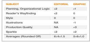 We also devised a scoring method for judging editorial and graphic
quality. Each item is rated on a scale from -3 to +3. Best is +3.
Each of the columns—one for editorial, one for graphic quality—is
then added up, and overall averages computed. (In the example below,
numbers are imaginary, not based on an actual item.) Clearly, there’s
much room for improvement.
We also devised a scoring method for judging editorial and graphic
quality. Each item is rated on a scale from -3 to +3. Best is +3.
Each of the columns—one for editorial, one for graphic quality—is
then added up, and overall averages computed. (In the example below,
numbers are imaginary, not based on an actual item.) Clearly, there’s
much room for improvement.
news headlines
practice
business
design
recent related
› Electronic Document Management for the Small Office
› What Do You Look for in Hiring a New Designer?
› To Document or Not to Document
From “Praise
for the First Edition,” excerpted from the flyleaf of Writing
for Design Professionals, 2nd edition:
“Kliment has written a no-nonsense, step-by-step primer on communication
and, when you see it, you will say, ‘Of course! Why didn’t
someone write this book years ago?’ . . . The book is engaging
as a straight read, but it is also exceptionally well organized and, therefore,
a handy reference . . . Whether you’re a seasoned professional
or architecture student, I’ll wager you’ll enjoy and learn
from Writing for Design Professionals. Write
and tell me all about it (after you read the book!).”
—Stephanie Stubbs, Assoc. AIA, AIArchitect
For more information on Writing for Design Professionals, 2nd ed., visit the AIA Web site or call 800-365-2724, option 4.
A printer-friendly version of this article is available.
Download the PDF file (164 Kb).