

6/2006

by Russell Boniface
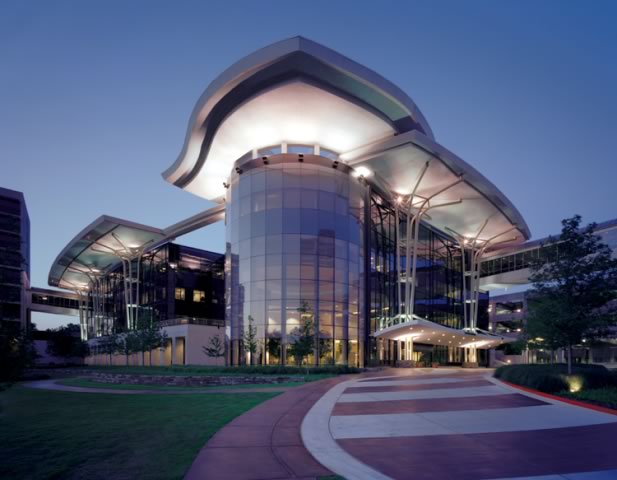
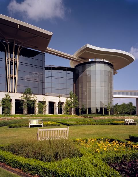
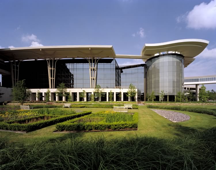
The new Warren Medical Office Park in Tulsa, Okla., melds old and new styles of health-care architecture. The 21st-century campus design—by Minneapolis-based Hammel, Green and Abrahamson Inc—positions a curved state-of-the-art cantilever glass building as its centerpiece linked to an existing mid-20th-century-style hospital and three, 12-story steel, concrete, and glass medical office buildings built in the 1970s and ’80s. What was a sea of concrete and asphalt is now a lush garden of a medical campus, with a 42,000-square-foot ambulatory-care center, indoor park rotunda, sustainable interior design elements, and, for increased wayfinding, a user-friendly landscape with elevated skywalks. The building was completed in August 2004, and tenant suites have since been fitted.
 A healing environment
Hammel, Green and Abrahamson Inc. (HGA) served as master planner of the
$38 million transformation of the dated Saint Francis Hospital into
the new, open Warren Medical Office Park. Working around an existing
footprint of the three hospital towers, HGA created a welcoming, easy-to-navigate
campus that showcases the new 177,000-square-foot steel, stone, and
glass-clad Natalie Building. Serving as the hub of the facility, the
Natalie Building houses the medical offices and an ambulatory-care
center. Its four-story rotunda contrasts the old, cotton-candy pink
Saint Francis Hospital, 500 feet away, and the three towers.
According to Thomas Cooper, chair and CEO of The Warren Professional Building Corporation, which owns and operates the campus, the industrial look didn’t offer a welcoming and healing place. “The area was never planned as a campus,” Cooper says. “Buildings just popped up. We wanted a new campus hub that was forward-looking; one that wouldn't make the old towers look shabby but would update them by creating a strong architectural contrast.” The Warren Professional Building Corporation wanted a campus that would provide 80,000 square feet of physician lease space, have LEED® accreditation, a state-of-the-art ambulatory care facility, and easy-access parking to accommodate 1,600 cars. The overarching goal, however, was a “big picture” healing environment.
 The Natalie Building
The four-story Natalie Building is named after Natalie Warren of the
Tulsa family who built the hospital. The building takes its inspiration
from the curving forms and shapes of Tulsa’s Art Deco buildings.
It is clad in high-performance, silkscreen-patterned glass—offering
an open, transparent, welcoming feel to patients—and is topped
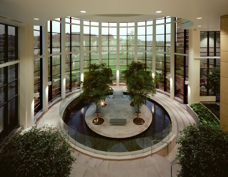
by a cantilevered, wavelike canopy roof above clerestory windows. Inside
the building’s three-story rotunda a circular indoor garden with
its fountain offer spaces for reflection and interaction. The facility’s
design lends itself to large group practices and allows doctors to
operate on patients at an outpatient level in the same building where
they have their clinical offices.
Dan Polachek, AIA, vice president at HGA, says aging medical campuses are common problems in health care nowadays, particularly in clinics housing multiple practices. “Groups of doctors are getting bigger and bigger, and they are having a hard time fitting into the older footprint buildings, such as the three older towers around the Natalie Building,” says Polacheck. “In their day, they were nice buildings, but that was the Brutalist era, when we used a lot of exposed concrete. The suites are no more than 40 feet deep and just don’t function well for health care. St. Francis Hospital was losing doctors because it couldn’t find space suitable for them.”
 “The Warren family wanted the new building to have a fountain
that commemorates St. Francis of Xavier, who baptized thousands as a
missionary to China,” explains Polacheck. “We thought a central
fountain element that could start in the rotunda and work its way into
the campus would be appropriate.”
“The Warren family wanted the new building to have a fountain
that commemorates St. Francis of Xavier, who baptized thousands as a
missionary to China,” explains Polacheck. “We thought a central
fountain element that could start in the rotunda and work its way into
the campus would be appropriate.”
Polachek explains that the Natalie Building’s curves follow sun angles, while its cantilevered roof provides shade. The gray-tinted rotunda glass provides an open feel and is fritted to cut down on glare. “The owner wanted the color of the glass to be compatible with the existing towers,” describes Polacheck.
The rooflines atop the rotunda and the two adjoining cantilevered, overhanging canopy roofs also perform as sunscreens. The two roofs are held aloft outside the Natalie Building by tree-form steel supports, which reference the extensive tree plantings in the campus and the local program “Up With Trees” that supports reforesting the city. Limestone quarried from within 500 miles of the campus compose a colorful flagstone wall at the base of the building and a whiter stone by the surgery center. Limestone also extends into the landscape where it is used for walls and walkways.
 HGA
designed the Natalie Building to qualify for the U.S. Green Building
Council’s LEED certification and carefully considered, in addition to
the building’s orientation, its mechanical systems, energy use, and design
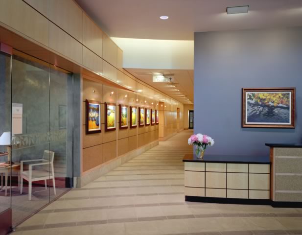
materials. Christine Vickery, interior designer, HGA, says her number-one
goal throughout the building’s interior was to create a stress-reducing
environment. “I didn’t want the building to feel like a clinic or
hospital,” Vickery says. She gave the interior a soothing color
palette from recycled paint, regional artwork, natural stone floors,
and glass doors to lessen the sense of the Natalie Building as a health-care
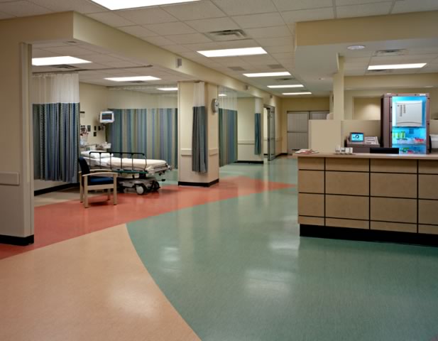
institution. In addition, the outpatient recovery and reception area
includes stations, cabinetry, and desks made of crushed sunflower-seed
hulls, and pre-surgery and operating room corridors feature floors with
an abstract leaf pattern.
HGA
designed the Natalie Building to qualify for the U.S. Green Building
Council’s LEED certification and carefully considered, in addition to
the building’s orientation, its mechanical systems, energy use, and design
materials. Christine Vickery, interior designer, HGA, says her number-one
goal throughout the building’s interior was to create a stress-reducing
environment. “I didn’t want the building to feel like a clinic or
hospital,” Vickery says. She gave the interior a soothing color
palette from recycled paint, regional artwork, natural stone floors,
and glass doors to lessen the sense of the Natalie Building as a health-care
institution. In addition, the outpatient recovery and reception area
includes stations, cabinetry, and desks made of crushed sunflower-seed
hulls, and pre-surgery and operating room corridors feature floors with
an abstract leaf pattern.
 A green campus; finding your way
The Dallas-based MESA Design Group served as the landscape architects
for the project, which includes more than 300 trees. They installed
lawns, flower gardens, more than 300 trees, herb gardens, fountains,
roof plazas, and walking paths all to reinforce the healing aspects
of the campus.
“We wanted wayfinding to be easy,” explains Polachek. “People won't have to take elevators or go down to the main level when they arrive. To see a certain doctor, you just park on the corresponding level of the garage and walk straight across one of these bridges right into their suite. That was important because a lot of doctors today are moving out to the suburbs where a patient can drive right up to their office, like in a strip mall, and just walk right in. We basically took that suburban idea and stacked it.
“I hate to call it a shopping mall approach, but at a large hospital, you have to get out of your car, go to the main level of the parking garage, walk out into what feels like the middle of a Wal-Mart lot, decide which way to go, cross the street, take another elevator to your doctor’s office—it can be a real mess. So the stacked, drive-up approach seemed to work much better.” Polachek says this idea also drove the notion of having the building's four-story rotunda in the center of the campus. “It allows you to get your bearings.”
 Polachek notes that in the parking garages he used the canopy form to
help people find the skyway bridges that go into the Natalie Building. “They
swoop upward and have a colored finish and are lit up, so, again, it
makes wayfinding easy and you can find the entry much better.” He
designed a new S-curved campus boulevard with only four distinct intersections
and clearly marked, concise signage. Each intersection leads directly
to one of the four medical office building.
Polachek notes that in the parking garages he used the canopy form to
help people find the skyway bridges that go into the Natalie Building. “They
swoop upward and have a colored finish and are lit up, so, again, it
makes wayfinding easy and you can find the entry much better.” He
designed a new S-curved campus boulevard with only four distinct intersections
and clearly marked, concise signage. Each intersection leads directly
to one of the four medical office building.
“Wherever there is an intersection, there is only one directional choice … we simplified the decision process,” Polachek points out. “We didn’t put a lot of text on any of the signage because often at hospitals the signs get to the point where you just don’t read them—there are too many building names, and you are moving too fast.”
Polachek also wanted the patient drop-off process to flow. “When you drop someone off, you drive directly to the front door and then follow the road around the building straight into the garage. Each parking ramp shares the name of the building it services.”
 Health-care design is in a good era
Cooper feels the steel-and-glass Natalie Building offers an open, transparent
welcome to patients and makes the facility look more like a campus. “The
rejuvenation has completely changed the campus’ image into one that
reflects the technical prowess and healing capacity of this health-care
system,” he says.
Polachek, who has been focusing on health-care design since 1991 and has completed approximately 50 health-care projects (one of which even allows patients to fish out of their windows in a natural environment) has seen a lot of changes in that field. “I think the changes have been for the better. Nobody wants to go to a health-care facility—it’s not something you look forward to—so design can help people have a better experience and make them feel better about it. And employees like working in better-designed buildings. Good design in health care is right in many, many ways. It is in a good era because we can now apply much better quality design to it than before.”
Copyright 2006 The American Institute of Architects.
All rights reserved. Home Page ![]()
![]()
![]()
![]()
![]()