

1/2006
Disparate projects capture 2006 AIA Honor Awards for Interior Architecture

Eleven projects, sharing a high-design edge yet disparate in function and size, serve as the 2006 recipients of AIA Honor Awards for Interior Architecture. Two of the projects successfully addressed the modernization of 1960s architecture, while another pair—one on the West Coast and the other on the East—created theater space with shoestring budgets and very inventive partis. Ten of the projects are located in the U.S.; the eleventh is in London. All involve existing space; many transformed it for a new use.
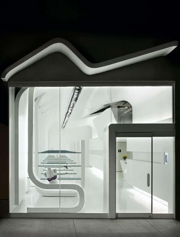 Bizarre, Omaha, by Randy Brown Architects, for Djel Brown
This women’s boutique offered the architects an opportunity to
challenge the typical retail store conventions “where the walls,
fixtures, ceilings, and floors are all separate elements,” they
say. They developed the interior space by folding and cutting a piece
of paper to simplify the design language. This translated to a continuous
surface that bends and folds to display merchandise and conceal the mechanical,
electrical, and structural systems. The space’s narrow bay is divided
into an enclosed space and an open space that contains a series of equally
spaced pods to organize the merchandise. “The form of the building
interior relates to function of space and goes to create something purposeful,” the
jury noted. “Its curvilinear planes are willful and speak to the
sensuous quality of the retail store’s inventory.”
Photo © Assassi Productions.
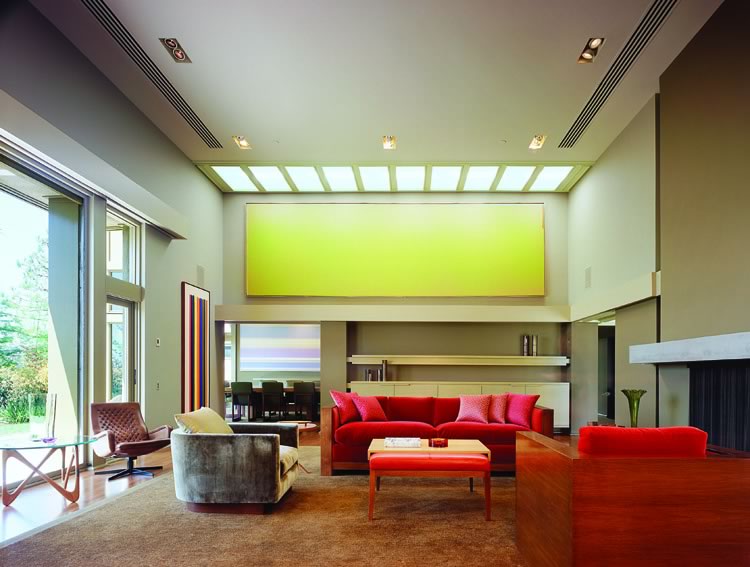 English Residence, Beverly Hills, Calif., by Chu + Gooding Architects
and interior designer Kay Kollar Design, for Tobias Emmerich
English Residence, Beverly Hills, Calif., by Chu + Gooding Architects
and interior designer Kay Kollar Design, for Tobias Emmerich
The owners of this mid-century Modern glass house by Harwell Hamilton
Harris charged the architects with restoring the building to Harris’ original
architectural intention while meeting the needs of their contemporary
lifestyle. The architects used the existing caissons and basement slab
to restore the original footprint of a service wing on the lower and
upper levels while reconfiguring interior walls, gaining back the original
design’s two bedrooms, bath, kitchen, family room, and breakfast
room—plus space on the basement level for a gym. Throughout the
house, the original detailing, which included glass-coffered ceilings,
was restored. The jury deemed this project, “a really good example
of the preservation and extension of mid-century Modernism.” They
remarked: “Architects enhanced the current occupant’s needs,
demonstrating that mid-century Modern can have an extended life.”
Photo © Benny Chan, Fotoworks.
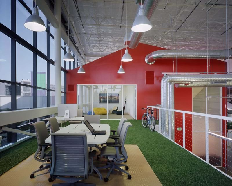 Google Headquarters, Mountain View, Calif., by Clive Wilkinson Architects,
for Google Inc.
Google Headquarters, Mountain View, Calif., by Clive Wilkinson Architects,
for Google Inc.
The master plan for this project, which resulted from a strategic workplace
reevaluation and need to expand by a renowned Internet company, follows
a simple distribution of work “neighborhoods” along a “Main
Street” circulation plan. All share resources—meeting rooms, “tech
talk” spaces, micro-kitchens, and library lounge—and find
their homes along Main Street. Facility performance is tied to four main
criteria: flexibility and adaptability to allow workgroup mobility and
reconfiguration; concentration and collaboration through a system of
three-person work rooms that are custom-fabricated to allow control of
light, sound, air flow, and other environmental factors; work/life balance
for people who work long hours through support services such as kitchens
and open spaces for spontaneous meetings; and leveraged learning through
the “tech talk zones,” where almost continuous seminars and
knowledge sharing take place. A sustainable, energy-conserving environment
also was high on the client’s list. “Elements of playfulness
and humor are integrated with advanced technology,” the jury noted. “It’s
a place where we’d like to work.”
Photo © Benny Chan, Fotoworks.
 Karla, Miami, by Rene Gonzalez Architect Inc, with associate architect
Rene Gonzalez Architect AIA, for Karla Conceptual Event Experiences
Karla, Miami, by Rene Gonzalez Architect Inc, with associate architect
Rene Gonzalez Architect AIA, for Karla Conceptual Event Experiences
The jury called this project “a masterful transformation of an
undistinguished shell into a temple of light.” The architects’ magic
turned an industrial warehouse and adjacent overgrown vacant lot into
a flexible space that fosters large-scale production of floral arrangements
as well as the staging of events for the local corporate and entertainment
community. The architect reoriented the primary entrance to the lot and
created a series of garden spaces for events and ancillary activities.
Interior spaces center on two internally lighted acrylic walls fronted
by the lobby and reception area. Throughout the project, spaces and fixtures
were designed and chosen with simplicity of form and material to maximize
effect while staying within a budget. “This is a remarkable juxtaposition
of a lush subtropical setting with the building’s clinically white
interior,” the jury remarked. “It gives you a huge sense
of serenity; the pieces are selective and contemplative.”
Photo © Ken Hayden.
 Mother London, London, by Clive Wilkinson Architects, for Mother
Space for this advertising agency, which grew in six years from a six-person
operation to the number one agency in Britain, had to treble the workspace
for the staff and capture a radical attitude that embraces a completely
flat organizational curve. Everyone in the firm works around a single
work table, which has grown progressively larger as the staff expanded.
Working within the client-selected three-floor, 42,000-square-foot
existing warehouse, the architect transformed the top floor, which
boasts 13-foot ceilings and 14,000 square feet of open area, into the
primary work area. It houses a 250-foot-long cast-in-place concrete
work table and is configured like a racetrack, taking cues from Turin’s
Fiat headquarters, which is topped with a rooftop racetrack. All surfaces,
including the floors, are painted white, and architect-designed seven-foot-long
lampshades padded with acoustic foam dampen sound in the open space. “The
level of creativity and imagination equal the ambition of the client,” the
jury said. “It’s a bold approach to creating place for
ideas where anything can happen.”
Photo © Adrian Wilson.
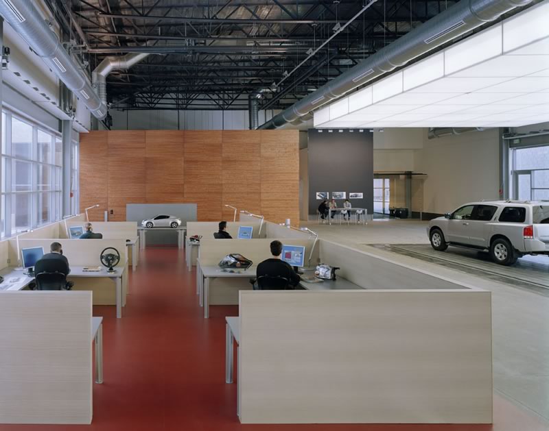 Nissan
Design America, Farmington Hills, Mich., by design architect Luce et
Studio Architects, with executive architect Albert Kahn Associates
Inc., for Nissan Design America
Nissan
Design America, Farmington Hills, Mich., by design architect Luce et
Studio Architects, with executive architect Albert Kahn Associates
Inc., for Nissan Design America
The client challenged the architect to create a “synergistic, creative
work environment that would strike a balance between the frank industrial
nature of the program and architectural sophistication” by adding
a wing for automotive design that would allow a seamless evolution from
conception to prototype. The resulting connective tissue that links the
30 designers to 400 engineers is a loggia space that serves as the public
entrance. Featuring a 20-foot-tall pivoting stainless steel door as well
as a 20-foot-tall projecting screen, the public space allows the staff
to communicate through visual images, creating a “public landscape
of the design process.” A new modeling studio features the traditional
bedplate of steel, which allows up to five models to be developed and
tested simultaneously. “The project’s strong detailing reflects
precision engineering,” said the jury. “It utilizes moving
parts with great finesse. Design elements are scaled to those of large-scaled
mechanisms.”
Photo ©Paul Rivera/archphoto.
 The
Royal Bank of Scotland plc, Houston, by DMJM Rottet, for the Royal
Bank of Scotland plc
The
Royal Bank of Scotland plc, Houston, by DMJM Rottet, for the Royal
Bank of Scotland plc
The design team needed to create an office environment for an international
bank client that had recently split into two groups, allowing each group
its own identity while also creating some communal space for them to
share. The architects employed a “box-within-a-box” concept
for the public areas while maximizing the light and views that come with
the client’s location on the 65th floor of a Pei Cobb Freed building.
Using a subtle form of branding, the interior motif plays on the concept
of pattern and grids within a Scottish tartan rather than employing decorative
motifs or overt logos. Art from local artists adorns the walls, and an
entertaining bar within the space serves as a gathering place that pleases
employees and clients alike. “Simply gorgeous, exquisite—nirvana!" exclaimed
the jury. “We like the monochromatic palette of sublime materials
juxtaposed and woven into a composition exuding restraint and sophistication.”
Photo © Benny Chan, Fotoworks.
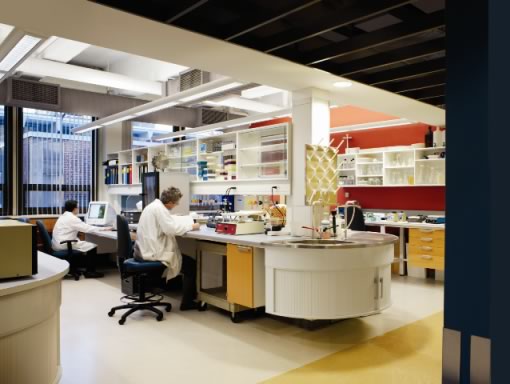 Schepens
Eye Research Institute Laboratory Renovation, Boston, by Payette, for
Schepens Eye Research Institute
Schepens
Eye Research Institute Laboratory Renovation, Boston, by Payette, for
Schepens Eye Research Institute
The architects used studies in transparency, translucency, and contrasts
in color and texture to completely transform 64,000 square feet of “tired” lab
space into three floors of state-of-the-art molecular biology research
environment. A racetrack corridor scheme became an open laboratory design
that enhances the interaction among research groups and dramatically
increases the amount of assignable lab and lab support space. The renovation
takes full advantage of large perimeter windows to maximize the amount
of natural light and the loftlike feeling of the space. A total redesign
of the main lobby expresses the client’s desire to become more
visually open to the streetscape. The jury admired this project’s “creativity
used in a project type that normally has many restrictions.” They
especially like the beautifully designed research areas that allow natural
light to be introduced deep into the lab area.
Photo © Warren Jagger.
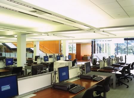 Skillman
Library, Lafayette College, Easton, Pa., by Ann Beha Architects,
for Lafayette College
Skillman
Library, Lafayette College, Easton, Pa., by Ann Beha Architects,
for Lafayette College
The jury called this project a “great transformation of a 1960s
building.” They particularly appreciated its “wonderful sense
of detail and use of carefully crafted materials,” and how it addresses
the faults of the original building with a clear distinction between
new and old. The architect strove to expand and transform an undervalued
and underappreciated 1964 library of 75,000 square feet into a new learning
center where students can work collaboratively and at the same time establish
a connection with surrounding buildings, circulation paths, and landscaping
lacking in the original design. On its main level, the center—with
the addition of 30,000 square feet, now offers a large and flexible “information
studio,” with a café, casual reading areas, meeting areas,
group study rooms, digital project rooms, a gallery, and computer rooms.
An entry moved south orients and connects the building to the campus
green, and large expanses of glass connect inside and out.
Photo © Florian Holzheer.
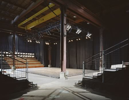 Temporary Theater, Portland, Ore., by BOORA Architects, for the
Portland Institute for Contemporary Art
Temporary Theater, Portland, Ore., by BOORA Architects, for the
Portland Institute for Contemporary Art
“Brilliant! Creative and inventive!” said the jury. “The
designers utilized true architectural means to create a concept and functional
space within a limited budget.” Designed for an institute of contemporary
art that each year presents a festival for contemporary performances of
theater, dance, music, and electronic media, this project turned an empty
warehouse into a performance venue with a 200-seat theater and a cabaret
stage, plus an ancillary bar and café. The architects delineated
the theater space from the rest of the warehouse with a wall of scaffolding
that hid production equipment. Additional scaffolding provided seating,
and an overhead gantry crane served as home for the theatrical lighting.
Pegboard and fire-treated visqueen—both left intact for future uses—defined
interior walls and created an intimate theater space within the vast warehouse.
Photo © Sally Schoolmaster.
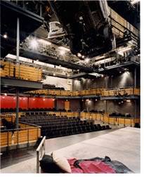 Woolly
Mammoth Theater Company, Washington, D.C., by McInturff Architects,
for the Woolly Mammoth Theater Company
Woolly
Mammoth Theater Company, Washington, D.C., by McInturff Architects,
for the Woolly Mammoth Theater Company
To provide a first-time home for an edgy-production theater company that
has been entertaining Washington, D.C., for 25 years, a developer offered
space—to be designed via a publicly funded competition—for
the rent of $1 per year. Embedded deep within a large residential/commercial
building at 14 feet below street level, the developer provided finished
exterior facades and a concrete shell, leaving interior fitout to the
theater. For expression and to meet the minimal budget, the architects
proposed retaining the crude shell and weaving necessary walls, stairs,
and ceilings within. “This energetic, open-ended design solution
is in sync with the progressive nature of the theater,” the jury
declared. “The architects get great mileage out of a very modest
budget while remaining totally free of clichés—the outward
appearance of the theater does not reveal the splendor within!”
Photo © Julia Heine.
Copyright 2006 The American Institute of Architects.
All rights reserved. Home Page ![]()
![]()
2006 Interior Architecture Honor Awards Jury
Linda Searl, FAIA
Searl and Associates Architects
Chicago
Andrea P. Leers, FAIA
Leers Weinzapfel Associates Architects
Boston
Marc D. L'Italien, AIA
Esherick Homsey Dodge & Davis
San Francisco
John I. Mesick, AIA
Mesick-Cohen-Wilson-Baker Architects
Schodack Landing, N.Y.
Herman Mhire
Museum Consultant
Lafayette, La.
![]()
![]()
![]()