
1/2006

by Russell Boniface
Associate Editor
Do you have big, blank walls in your building that need some spicing up? Digital technology might be able to help.
Large-scale, computer-generated murals can now be produced, and reproduced, in a timely and budget-conscious fashion. Facilities such as offices, hotels, bookstores, hospitals, restaurants, and banks can fill large, interior open areas with art that meets both size requirements and creative themes.
 Mural, mural on the wall
A mural is designed for a specific space—either inside or outside—to
help give a building’s design an identity.
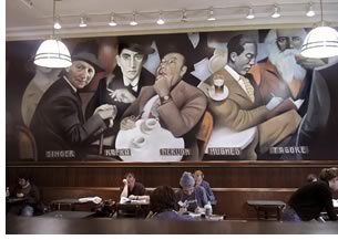
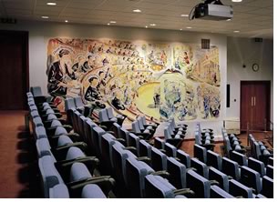
For example, if you walk into one of the “muralesque” Barnes & Noble bookstores across the country, you will find its walls adorned with an extended, overhead portrait of literary figures like Walt Whitman and Oscar Wilde gathering for coffee. Or, if you paid a visit to the Royal College of Surgeons of England, you will see an oil canvas in a conference room depicting a scene of famous surgeons observing an operation from a tiered theater.
These large-scale, digital murals are actual fine art—not computer-generated. They are, however, digitally enlarged, enabling architects and interior designers to develop and choose large visual and spatial concepts for an open space. Although the business of providing fine-art digital murals has expanded in recent years, Richard Solomon Artists Representative in New York City is unique because it provides grand-scale murals with speed and economy. Plus, it offers architects and interior designers a chance to collaborate with the actual artists, both creatively and technically. Fabricators and installators are also part of the collaborative team that is provided.
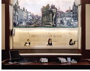
The new division of the agency is called Art on a Grand Scale and is devoted exclusively to fine art digitally reproduced for grand-scale spaces. Diverse clients such as Barnes & Noble, Lincoln Center in New York City, Disney, The History Channel, LaSalle Bank in Chicago, the American Museum of Natural History, The Venetian Resort Hotel and Casino in Las Vegas, and the United Nations have commissioned grand-scale designs to coordinate with their structure’s architectural elements.
“If you have a big, open wall space, such as a hotel lobby, restaurant dining room, or food court, the technology exists to fill it creatively,” Solomon says. “We have a broad base of artistic talent to fill those open spaces.”
Solomon has 30 artists on his staff. While the organization specializes in cover art for such clients as Time magazine and theater posters such as for HBO, Solomon wanted to move into the area of large, fabricated custom murals. His artists, or illustrators as he prefers to call them, cooperatively work with art directors and architects to fill open wall space stylistically and interpretively. Although the illustrators do fine art, they don’t think like fine artists, says Solomon. “Architects will not get these large-scale custom murals done from fine artists. Professional illustrators, however, know how to solve time and space problems.”
 One-stop gallery of grand art
Traditional murals are a laborious and time-consuming undertaking that
has made them prohibitively expensive for many commercial projects.
A large mural can take as long as a year to complete and, depending
on the celebrity of the artist, bear a high price tag. Through cutting-edge,
digital reproduction technologies, Art on a Grand Scale can shorten
that time to as little as four weeks, thus reducing cost dramatically.
And, where muralists traditionally charge by the square foot, Art on
a Grand Scale charges a single creative fee for the original art work.
A portfolio of contextual art samples is the key, believes Solomon, to convincing an architect, interior designer, or business’ art director that his agency can meet their needs. His goal is to have a bank of 100 samples, if not more, to demonstrate his artists’ “intrinsic” capabilities and how their work can be applicable to filling a physical space.
“I can go to an illustrator and say, ‘I’d like you to do a mural for a food court for a Las Vegas hotel,’” Solomon explains. “It’s hundreds of feet long and there are 17 restaurants of different cuisines, and above these restaurants, above eye level, is 100x20 feet segmented to represent different countries and cuisines. The idea is for us to have a Web-based portfolio of these types of contextual samples to show an architect that this is the type of illustration we can create and provide. This way, I can say to a client, ‘Here are my artists, their styles, and capabilities.’”
Old art school meets new art school
Although Solomon’s artists are from the “old school,” the technology to create the digital murals is new school. “We
have oil painters, engravers, and water colororists who use techniques
that have been used for 500 years and are the top artists in their field,” says
Solomon.
His artists are familiar with painting or printing large works, but it’s the broader strokes of taking the art and enlarging it to an even grander scale that is the rewarding challenge of the operation. The first step in the process is for a client, architect, or interior designer to identify a mural’s specifications and theme. “The architect would work with me initially to provide the specifications, and they will work with their interior designer or themselves to determine the theme and how the disparate elements of the theme will provide a seamless piece of art that doesn’t look like a hodgepodge.”
 The next step in the process, Solomon says, is for an architect or interior
designer to determine what textual material is best to suit the mural’s
environment. “Is the mural going to be affected by wind or ultraviolet
rays? Is it indoors? Does the client want it to last a year, 5 years,
or 10 years? I am the conduit to get that done.”
Now that the theme and mural texture are determined, Solomon will determine which artist is right for the job, the creative and production fees, and how long the job should take. Fees depend on how famous the artist is and how much time the artist will need to work on the project. Solomon will also refer the architect to a fabricator, although the fabricator will charge by the square foot. “But the beauty of it is,” adds Solomon, “the job is still proportionately less expensive than if you have a crew of 12 people painting away for six months. Plus, the mural we provide is the vision of one artist, as opposed to many painters hoping they are getting the color coordination right. It’s not a paint by numbers job.”
Once an artist is chosen, pencil sketches will be drawn. “My artist will create the illustration based on the proportion of the clients’ needs.” says Solomon. “For example, if the proportions are 60x10 feet, then the artist will do the job in a 6x1 ratio. A month later the finish comes in at a proportional size and is scanned and delivered to the client. The digital file is given to the fabricator who determines the texture material based on the architect’s needs. The fabrics are then produced into strips, and can also be reproduced if duplicates are required. Once the illustration is texturized, a finish illustration is ready to be hung. The architect or interior designer will put it up and hopefully the client is thrilled. At that point it’s not going to take much time to put up because it’s not as if you have to have a scaffold and close down a building for a weekend. It’s basically sophisticated wallpaper, something that hangs between two posts like a flag.”
Picture perfect success
Architect Walter Fleming of Austin, Tex., believes murals are underutilized. “Using
a mural that has been digitized and can be reused in a number of different
settings is really the only way to go,” he says. “Absolutely.
I think especially for applications of repetitive work, such as restaurant
or bookstore chains. It’s the most economical for a client.”
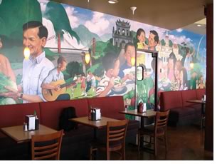
Fleming and his client Pho Hoa Restaurants (pronounced “fur huh-ah”) worked with Art on a Grand Scale to develop an impactful mural for the Vietnamese-themed restaurant chain. Pho Hoa Restaurants has almost 90 stores in the U.S., Canada, and Asia.
“The thought of the mural came up because I believe a picture is worth a thousand words,” says Fleming. “It really can help in the décor process. I introduced the idea to the client and he got real excited about it. We kicked around what his mural could be. We knew we wanted to introduce color and a theme. Then we started looking at some of Richard Solomon’s artists. They are by far and away the best collection of illustrators in the country. The client and I interviewed each artist and then made a selection. In the end, the mural reinforced Vietnamese culture and settings and conveyed the idea that Pho Hoa is a Vietnamese noodle soup company that serves very fresh, made-to-order food.”
The Pho Hoa mural was 10x40 feet. “The original piece of art was 16-18 inches tall and 4 or 5 feet long, but it was blown up 7 or 8 times,” Fleming describes. “And the client can use that same piece in multiple settings since it’s scanned and in the computer. It can economically be reproduced any number of times.”
 Fleming points out that a client can also get the same mural in various
sizes if, for example, the wall dimensions might vary at a chain restaurant’s
various locations. “Any different size you need it to be. We could
have taken that same mural and made it as long as I wanted. You could
even flip the mural so, for example, if the original art was on the right,
you can flip it to be on the left.”
In a previous mural experience, Fleming had a farm scene at an inn that needed to be a few feet longer to the right. No worries, as he stretched it as far as possible without distorting the image and, from the original digital art work, created a new farm scene from the existing farm scene to fill the space.
“One mural that I installed was on a busy stairwell and it became torn in one area so we just cut out the damaged spot and patched in another piece. If you look pretty close you could see the patch, but most customers wouldn’t notice it.”
Weather elements are a factor, Fleming stresses. “You have to investigate the location of the mural,” he says. “If it’s going to be near a window, you would like to have UV protection. Most of the 3M products have UV protection that can be added to the process. I think you pay a little extra for it, but it will guarantee the life of the mural. I once did an exploration for a restaurant in Las Vegas for an exterior mural and worked with 3M to consider wall products that they guaranteed would stand up under the Nevada sun for 8-10 years. So you definitely have to take into account the mural’s location and area surrounding it.”
Last the test of time
Solomon says that the Art on a Grand scale concept was “a gleam
in my eye about three years ago.” In the last year to 18 months,
his agency has signed more artists of various genres, photographers,
and multimedia talent. “It has really come together,” he
says. “Can I solve every problem? No, but hopefully we will be
able to provide solutions to clients who have a problem and are looking
to solve it visually.
“Murals are different than magazine covers because they are long-term. Perhaps fewer people will see a mural than will ever see a magazine cover. But they might see that magazine cover for seven days, and then it’s in the garbage pail. A mural not only has to be beautiful and tell a story, but it has to be captivating enough to last the test of time.”
Copyright 2006 The American Institute of Architects.
All rights reserved. Home Page ![]()
![]()
For more information on Art on a Grand Scale, go to the Richard Solomon Artists Representative Web site or call 212-223-9545.
![]()