

01/2005
The 2005 AIA Honor Awards for Interior Architecture projects range in scope from a boys’ club renovated over a five-year period and on a shoestring budget to an exclusive penthouse apartment. Seven of the 2005 interior architecture awards projects are located in the continental U.S., two are in London, one in Paris, and one in Ontario, Canada. Retail space and corporate offices received high design marks, as projects within that building type garnered six awards. The boys’ club, residential penthouse, plus a Jewish temple, university building, and university art museum round out this year’s list.
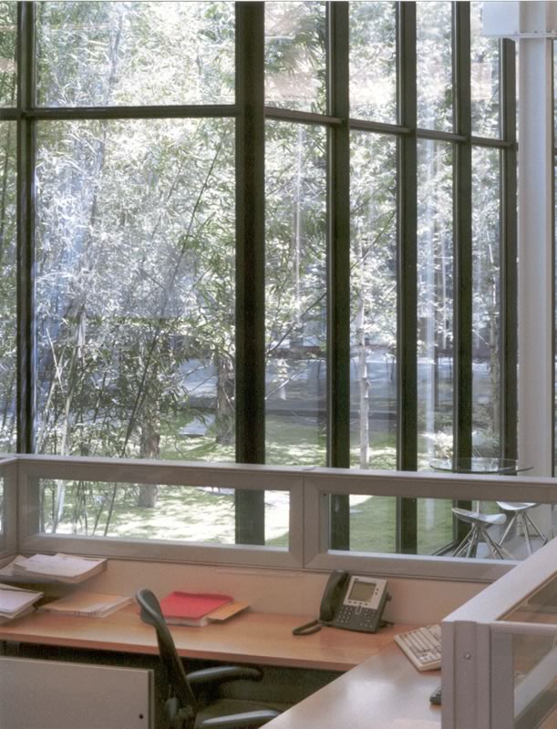
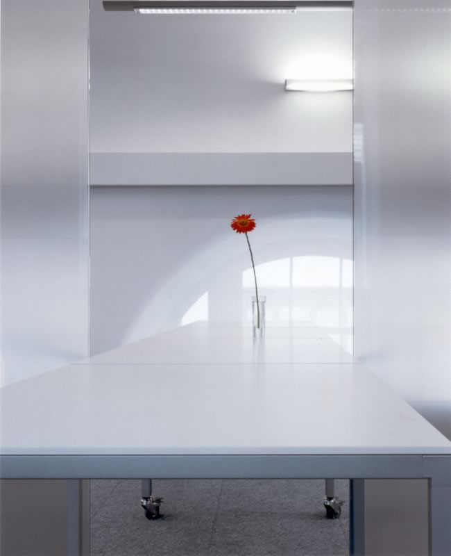 Ackerman International, London
Elliott + Associates Architects, for Ackerman McQueen
The architects strove to capture London as a place for this 1,800-square-foot
advertising agency office. They focused on creating a space that is simultaneously
very traditional and very Modern. The program required that the workstations
and conference rooms feel like “one big coffee lounge,” and
the resultant plan consisted of a “four corner” concept for
workstations for acoustic and visual privacy. The conference rooms have
transparent enclosures with big sliding glass doors to open or close
the remaining and adjacent space. The space was designed to be changeable,
mobile, and transparent, allowing lots of light to pass through. “The
illusion and abstraction of London fog carries the project—the space
has a coloration of a black and white photograph,” the jury remarked. “The
architect is acutely aware of when to throw in a flicker of color. It’s
a ghostly, moody, and melancholic space.”
Photo © Robert Shimer, Hedrich Blessing.
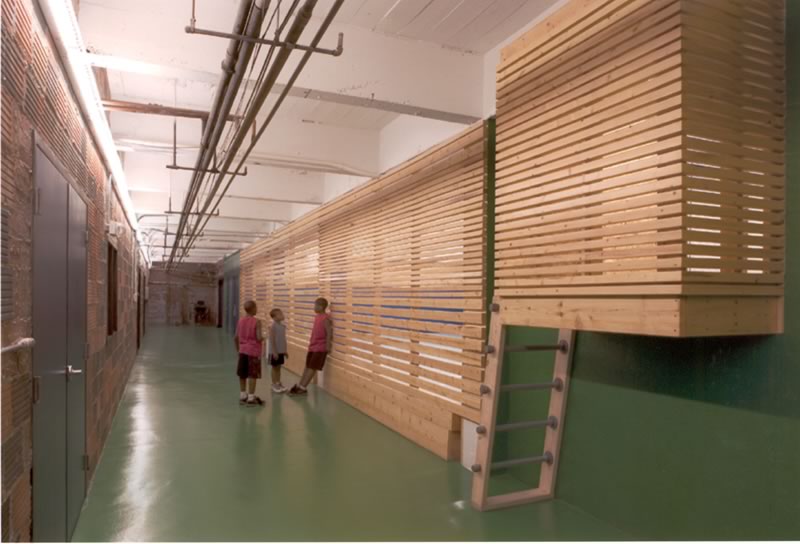 Boys’ Club of Sioux City, Sioux City, Iowa
Randy Brown Architects, for Boys’ Club of Sioux City
Originally built as an armory in the early 1900s, this building became
home to the Boys’ Club in the 1950s. More recently, although more
space was needed, budget required that most rooms and walls remain. While
the location and size of rooms were predetermined, the architects were
able to transform the spaces by the intervention of new architectural
objects. Over a five-year construction period, spaces were stripped back
to their original constructions: Old wood floors were found, ceiling
grids were eliminated, and plaster ceilings reclaimed. When new materials
were needed, tile, plaster, sheet metal, plywood, chain link, 2x4s,
and oriented strandboard were chosen for durability. Storage rooms were
cleaned out and transformed into a custom treehouse/play structure while
other found space became the Teen Room. Additionally, the architects
added 50 interior windows to previously isolated rooms to improve staff
monitoring and visually connect the spaces. The jury pronounced this
building “a labor
of love—a true community project.”
Photo © Farshid Assassi.
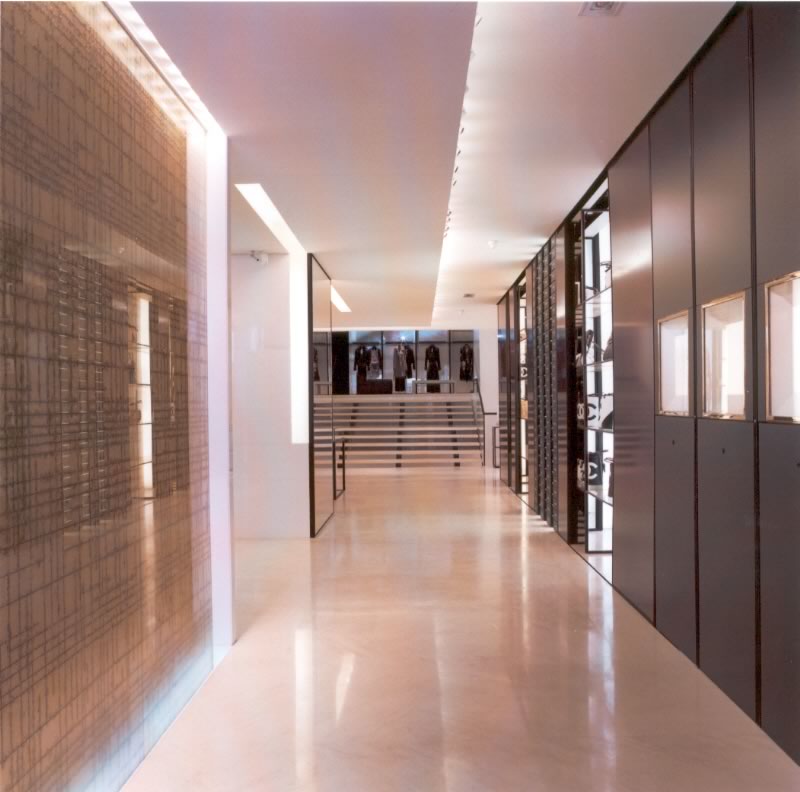 Chanel, Paris
Peter Marino + Assoc. Architects with associate architect Vigneron Architects,
for Chanel
The Chanel boutique on Rue Cambon in Paris is an expansion and redesign
of Mademoiselle Coco Chanel’s original boutique beneath her legendary
studio and apartments in Paris. Upon entering the store, one is immediately
introduced to the strong graphic statement of the iconic Chanel tweed
in the form of a hand-hammered, gold-leaf glass wall. Throughout the
store, carbon-fiber panels with gold thread and poured-resin panels inset
with diamond dust, continue the tweed theme to define and articulate
the spaces on each level. Antique silk ribbons, the only remaining from
the Coco Chanel material archive, are woven into the screens in the eveningwear
section to create an ambience of the ultimate in luxury. A floating staircase
links the original boutique space on axis to the expanded area in the
rear and below, with a theatrical floor-to-ceiling video exposure of
the ready-to-wear collection at the top of the stairs. “The sensibility
of black and white mimics the tension between the building and the clothes,” the
jury said. “Interwoven silk ribbons bring a museum quality to the
materials. We love the quality of backlighting—it evokes Chanel.”
Photo © Vincent Knapp.
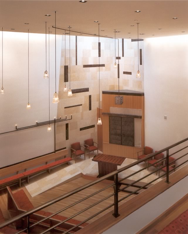 East End Temple, New York City
BKSK Architects LLP, for East End Temple
The new home of this temple formerly served as a residence built in 1883
by Richard Morris Hunt. Its façade and the front library room,
all that remained reasonably intact, have been restored to their former
elegance and adapted to the temple’s needs. The sanctuary was designed
to embody many of the symbols of Jewish faith. Natural light as a traditional
symbol of divine presence is brought into the space high over the ark.
The shaping of the space, the flow of materials, and the presentation
of the religious iconography highlight the temple’s emphasis on
inclusiveness. The lectern is acacia wood, described in the Book of Exodus
as the wood of the frames used in supporting the structure that was the
original tabernacle. “The project is created in a 25-foot width,
but with strategic planning it feels much more spatial . . . It’s
like a piece of jewelry in its attention to detail and custom-designed
elements,” said the jury. “The elements of faith are woven
into the fabric of the interior.”
Photo Credit © Jonathan Wallen.
 Elie Tahari Fashion Design Office & Warehouse,
Millburn, N.J.
Elie Tahari Fashion Design Office & Warehouse,
Millburn, N.J.
Voorsanger Architects PC, for Elie Tahari
The architects created the Elie Tahari Fashion Design Offices and warehouse
complex from a renovated storage facility in suburban New Jersey. They
brought light and landscape inside to the working staff by cutting into
the roof structure to create two courtyards. The structural system was
reinforced and the interior perimeter fitted with glass paneling, leaving
the new spaces open to the sky and letting in natural light. The centrally
positioned courtyards are accessible to the activities of the office
and symmetrical to the entry axis. The edges of the garden are left largely
transparent so that the natural elements can be experienced deep within
the office space. “Within a context where looking out is less desirable,
the project creates an interior life,” the jury remarked. “It takes
a banal existing building type and with a few deft moves layers public
space, courtyards, offices, and industrial space.”
Photo © Elizabeth Felicella.
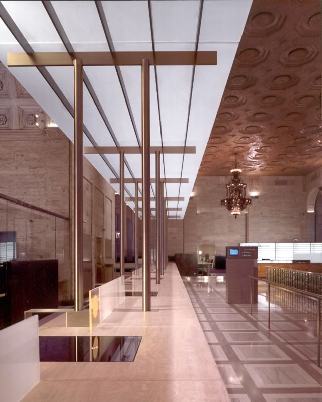 Hyde Park Bank Building Hall, Chicago
Florian Architects PC, for Hyde Park Bank & Trust Co.
The historic Hyde Park Bank occupies the second floor of this Chicago
neighborhood’s principal office building. The program called for
restoring the grandeur of an historic banking hall while conveying a
sense of security, continuity, and the bank’s importance to the
community. The architects redesigned the structural supports for metal
mesh screens, glass walls, and teller canopy, refining them to minimal
sizes. They also raised the glass partitions off the floor to maintain
airflow. Vertical surfaces of translucent glass shield expediting areas
and diffuse light, while striated shrouds of composite wood and stainless
steel grills shield rift-sawn oak work surfaces. The jury found the project
to be graceful and respectful in that it doesn’t mimic the existing
building. “It’s extraordinarily refined,” they said. “It
extends the elegance of the space non-stylistically.”
Photo © Barbara Karant, Karant Associates Inc.
 James Stewart Center for Mathematics, Hamilton, Ont.
Kuwabara Payne McKenna Blumberg Architects, for McMaster University
This project is an adaptive reuse of 1929 Hamilton Hall, one of the oldest
buildings on the McMaster University campus. The architects’ objective
was to create a facility that recognizes the interactive nature of mathematics
with spaces that promote team-based study and research. They chose a
highly abstract and Modern interior in stark opposition to the historic
Collegiate Gothic exterior. The complete demolition of the dark, labyrinthine
interior exposed the concrete post-and-beam construction, and existing
stone-framed Gothic windows served as the organizing nuclei for each
office. The offices are unified under a continuous ceiling plate that
allows the existing concrete beam and slab to define the full spatial
extents. “This is impressively progressive for an institutional
environment,” the jury said. “The client’s aspirations
have pushed forward the image of how a mathematics building is realized.”
Photo © Tom Arban Photography.
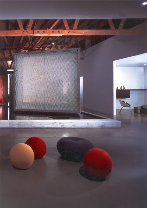 Jigsaw, Los Angeles
Pugh + Scarpa Architects, for Jon Hopp
For this film-editing facility, the architects transformed the interior
of a rough 1940s bow-truss warehouse into an entirely surprising and
inventive space. In the center of the space are two curvaceous volumes
suspended over a shallow pool of water. To create the windows’ light
diffusion required for the editors’ work inside the rooms, each
glass wall was fabricated from ordinary materials: one is filled with
Ping-Pong balls, another with acrylic beads. This same relationship between
object and space can be seen at a larger scale throughout the project,
where the residual or interstitial spaces among the objects and volumes
in the warehouse become niches for informal encounters. The design attempts
to create a series of balanced tensions, turning an office space into
an inspiring playground. “An unusual way to create an office and
a sculpture that transforms and enlivens the space,” the jury enthused. “The
materiality is intriguing and inventive.” The jury also liked the
experimentation and reinterpretation of materials: “A great party
space!”
Photo © Marvin Rand.
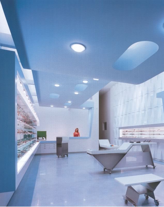 l.a. Eyeworks Showroom, Los Angeles
Neil M. Denari Architects, for Gai Gheradi and Barbara McReynolds
The client’s demand for this 1,150-square-foot store arose from
a unique relationship between the conventions of commercial retail space
and the stability of architecture usually associated with institutional
work. In working with the basic parameters of store design—such as the
demand for transparency from the street and from the sales counter—the
design shapes space and movement through a continuous suspended surface.
The gaseous blue surface performs many functions: perforated ceiling
plane, window display, bench, shelving unit, and sales counter. A group
of furniture elements, designed by the architects, acts as a mediator
of scale and movement. Finally, a wall of vacuum-formed panels, designed
by the artist Jim Iserman, fills the entire west wall of the store. “The
façade is lens-like—ocular and multi-faceted,” said the
jury. ”It’s a great place to test eyewear because there is
a lot to look at.” They also liked the hyperconnectivity of the
surfaces and architectural elements.
Photo Credit © Benny Chan, Fotoworks.
 Paul & Lulu
Hilliard University Art Museum, Lafayette, La.
Paul & Lulu
Hilliard University Art Museum, Lafayette, La.
Eskew + Dumez + Ripple, for the University of Louisiana at Lafayette
Situated adjacent to the original 1967 University Art Museum, this new
museum serves as a backdrop to the original. The 33,000-square-foot program
includes lobby and public spaces, permanent collection and changing exhibit
galleries, museum offices, archival storage, and art support spaces.
The building’s glass façade hovers above visitors entering
the museum, reflecting in its surface the existing building. Within the
limited material palette designated for museum exhibition, floor materials
serve to code a variety of uses: stone for public areas, wood for exhibition
areas, carpet for bookstore and office uses, and concrete for service
areas. A simple planning organization clearly differentiates art spaces
from support spaces. “Absolutely fantastic! The juxtaposition of
Modern steel and glass to historic plantation is incredibly well done,” the
jury exclaimed.
Photo © Timothy Hursley.
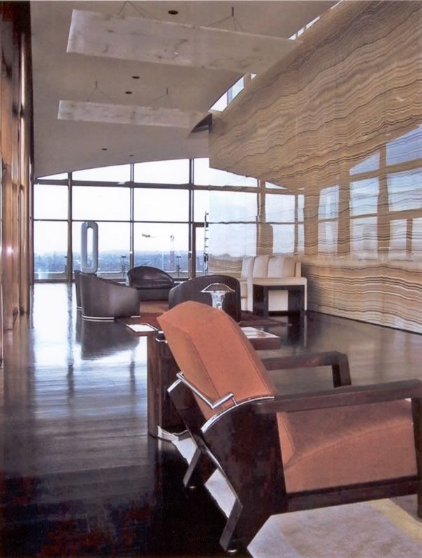 Pavilion in the Sky, London
Peter Marino + Assoc. Architects, for an unnamed owner
Designed for a Modern art collector, this 4,800-square-foot residence
occupies the top floor of a building along the Thames River, formerly
the headquarters of the London Gas Company. The penthouse is a 65-foot
by 65-foot square glass box with a shallow vaulted ceiling that rises
from about 13 feet at the corners to 16 feet at the center. A shimmering
cube of onyx surrounds the building’s core. From the center of
the onyx core, a stone entry hall leads through Lalique crystal paneled
doors and emerges to a landscape of sculptured forms that define the
more private zones of the residence. An L-shaped plane of shark hide
resting on a rosewood cube serves as the guest bedroom. A square reflecting
pool is carved into the black wood floor located in the northeast corner,
described by the architect as an “anti-object” reflecting
the sky and the onyx walls. “On first glance, our reaction was ‘What?
Wow!’” said the jury. “It’s sensationally over the top
and fantastic. There is strangeness to the project as well as a lot of
control . . . It’s gutsy.”
Photo © Fabrice Rambert.
Copyright 2004 The American Institute of Architects.
All rights reserved. Home Page ![]()
![]()
 |
||
2005
AIA Honor Awards for Interior Architecture jury
|
||