
This year’s 2003 Honor Awards projects range in size and scope from a single room to a new building for the New York Public Library. All of the 2003 interiors awards projects are located in the continental U.S. New York City tops the list of locations with the most projects (four), with other winners in Los Angeles, New Orleans, Oklahoma City, Las Vegas, and suburban Washington, D.C. “The broad range of work that has been selected is striking,” said the jury. “The projects we selected really separate themselves by their own inventiveness from the MOCA exhibit to the chapel in Louisiana. Some are really striking in their immediate impact, while others require you to look closer—like the floor in Lutece—to find subtle detail. The projects represent the spirit of something new, but in the freshest ways.”
Collins Gallery, Los Angeles, by Patrick J. Tighe, AIA, for Michael H. Collins. Photo © Art Gray.
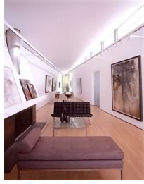 This
project, a remodel of an existing structure in West Hollywood, Calif.,
questions the tenets of traditional residential architecture by combining
the public function of an art gallery with the domestic components of
a house. The new building accommodates the needs of residents as well
as large gatherings. Its major architectural challenge was to create a
spacious gallery space within a relatively small building envelope. The
existing site condition consisted of a 1,400-square-foot residence of
substandard construction and no architectural significance on a 4,000-square-foot
lot. City regulations required that the square footage and footprint of
the existing structure be maintained, along with a minimum of 50 percent
of the existing walls. The architects created a scale-appropriate solution
that is in keeping with the neighboring buildings. They introduced a new
load-bearing wall that bisects the building on the diagonal, creating
two distinct zones and therefore separating the public from the private
functions. They also induced a forced perspective within the gallery by
allowing the space to taper in plan and section out to the garden courtyard.
A 20-foot-long reflecting pool extends the gallery-floor plane beyond
the building envelope. The domestic zone consists of two bedrooms, two
bathrooms, and a kitchen, all of which can be accessed from the main gallery
space. Sliding partitions of glass close off the rooms from the gallery.
“The unusual geometry of the plan works beautifully for living among
the works of art,” commented the jury. “The home shows an
intensity about the care in the making and an attention to detail and
craft.”
This
project, a remodel of an existing structure in West Hollywood, Calif.,
questions the tenets of traditional residential architecture by combining
the public function of an art gallery with the domestic components of
a house. The new building accommodates the needs of residents as well
as large gatherings. Its major architectural challenge was to create a
spacious gallery space within a relatively small building envelope. The
existing site condition consisted of a 1,400-square-foot residence of
substandard construction and no architectural significance on a 4,000-square-foot
lot. City regulations required that the square footage and footprint of
the existing structure be maintained, along with a minimum of 50 percent
of the existing walls. The architects created a scale-appropriate solution
that is in keeping with the neighboring buildings. They introduced a new
load-bearing wall that bisects the building on the diagonal, creating
two distinct zones and therefore separating the public from the private
functions. They also induced a forced perspective within the gallery by
allowing the space to taper in plan and section out to the garden courtyard.
A 20-foot-long reflecting pool extends the gallery-floor plane beyond
the building envelope. The domestic zone consists of two bedrooms, two
bathrooms, and a kitchen, all of which can be accessed from the main gallery
space. Sliding partitions of glass close off the rooms from the gallery.
“The unusual geometry of the plan works beautifully for living among
the works of art,” commented the jury. “The home shows an
intensity about the care in the making and an attention to detail and
craft.”
Global Crossing Corporate Headquarters, New York City, by Lee H. Skolnick Architecture, for Global Crossing, Inc. Photo © Peter Aaron/ESTO.
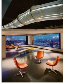 Global
Crossing, Inc., acquired several floors of office space as their new headquarters
within an award-winning office building designed in the 1970s by I.M.
Pei. The company’s vision was to project an extremely forward-looking
identity embodying the baseline tenets of the company: connectivity, speed,
security, and cutting-edge technology. The architects responded with a
design solution that strips all extraneous information from the space—partitions,
hung ceilings, standard lighting, and floor coverings—and adds back
only what was needed to provide appropriate workspace for the spirit and
function of the client. The result offers a pronounced juxtaposition of
a 21st-century, process-oriented enterprise in a classic 20th-century
corporate envelope. Responding to the spectacular top-floor New York City
views and the immediacy of communication that forms the core of Global
Crossing’s mission, the project became a laboratory for exploring
notions of transparency and translucency, openness and enclosure. The
attractiveness of what this company achieved and the success of the work
environment in interpreting its core qualities led up to its merger with
a communications giant. “Of all the corporate interiors, this was
the most successful in creating spaces versus developing work stations,”
the jury concluded. “It meets the requirement for collaboration
in a way that allows it to be memorable.”
Global
Crossing, Inc., acquired several floors of office space as their new headquarters
within an award-winning office building designed in the 1970s by I.M.
Pei. The company’s vision was to project an extremely forward-looking
identity embodying the baseline tenets of the company: connectivity, speed,
security, and cutting-edge technology. The architects responded with a
design solution that strips all extraneous information from the space—partitions,
hung ceilings, standard lighting, and floor coverings—and adds back
only what was needed to provide appropriate workspace for the spirit and
function of the client. The result offers a pronounced juxtaposition of
a 21st-century, process-oriented enterprise in a classic 20th-century
corporate envelope. Responding to the spectacular top-floor New York City
views and the immediacy of communication that forms the core of Global
Crossing’s mission, the project became a laboratory for exploring
notions of transparency and translucency, openness and enclosure. The
attractiveness of what this company achieved and the success of the work
environment in interpreting its core qualities led up to its merger with
a communications giant. “Of all the corporate interiors, this was
the most successful in creating spaces versus developing work stations,”
the jury concluded. “It meets the requirement for collaboration
in a way that allows it to be memorable.”
Craft, New York City, by Bentel & Bentel, Architects/Planners LLP, for Foodcraft LLC. Photo © Eduard Hueber, Arch Photo.
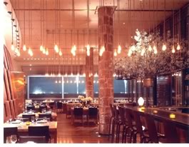 Foodcraft
LLC firmly believes that cooking of any kind is a craft, not an art. For
this restaurant, it planned to use the highest form of “uncomplicated
culinary craftsmanship to explore the full flavor of each artisan-raised
ingredient on the seasonal menu” and serve “these ingredients
unadorned on separate plates placed at the center of each table for all
to share.” The owner’s approach motivated the architect to
experiment with a limited set of materials and the most suitable craftsmanship
required to join them. The goal became to shape a simple yet texturally
and spatially rich interior that integrates with the food and service
both functionally and metaphorically. The resulting restaurant includes
130 seats, 3,500-bottle wine vault, and a 2,200-square-foot kitchen spread
over a 2,975-square-foot first floor and 2,450-square-foot cellar. Five
distinct elements—the rectilinear steel-and-bronze wine vault, a
curved Brazilian-walnut and leather-paneled wall, a space-expanding triptych,
existing terra-cotta-clad columns, and amber-hued, bare-bulb chandeliers—modulate
the scale of the 14-foot-high space of the first floor as patrons move
through the 80-foot-long room. All furnishings and fittings, including
the cherry dining tables and bronze bathroom sinks and hardware, were
designed to celebrate their materials and the simple craftsmanship used
to assemble them. “You don’t normally see brick, wood, steel,
and leather work together this well; the subtle contrast between raw and
refined materials creates a subtle tension in all the details,”
said the jury. They thought that the space dealt very effectively with
its acoustics and pronounced the overall scheme “very, very romantic.”
Foodcraft
LLC firmly believes that cooking of any kind is a craft, not an art. For
this restaurant, it planned to use the highest form of “uncomplicated
culinary craftsmanship to explore the full flavor of each artisan-raised
ingredient on the seasonal menu” and serve “these ingredients
unadorned on separate plates placed at the center of each table for all
to share.” The owner’s approach motivated the architect to
experiment with a limited set of materials and the most suitable craftsmanship
required to join them. The goal became to shape a simple yet texturally
and spatially rich interior that integrates with the food and service
both functionally and metaphorically. The resulting restaurant includes
130 seats, 3,500-bottle wine vault, and a 2,200-square-foot kitchen spread
over a 2,975-square-foot first floor and 2,450-square-foot cellar. Five
distinct elements—the rectilinear steel-and-bronze wine vault, a
curved Brazilian-walnut and leather-paneled wall, a space-expanding triptych,
existing terra-cotta-clad columns, and amber-hued, bare-bulb chandeliers—modulate
the scale of the 14-foot-high space of the first floor as patrons move
through the 80-foot-long room. All furnishings and fittings, including
the cherry dining tables and bronze bathroom sinks and hardware, were
designed to celebrate their materials and the simple craftsmanship used
to assemble them. “You don’t normally see brick, wood, steel,
and leather work together this well; the subtle contrast between raw and
refined materials creates a subtle tension in all the details,”
said the jury. They thought that the space dealt very effectively with
its acoustics and pronounced the overall scheme “very, very romantic.”
Kate and Laurance Eustis Chapel, New Orleans, by Eskew+Dumez+Ripple, for Ochsner Clinic Foundation. Photo by Neil Alexander of New Orleans.
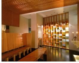 A
large medical institution commissioned this small chapel to serve the
spiritual needs of the hospital’s patients, families, and staff.
The new space replaces an existing hospital chapel that was subsumed within
the larger institutional environ-ment and essentially became invisible
to the public. Remodeling for expansion of the existing building’s
critical-care functions allowed the hospital to identify a new site that
offered an opportunity to resolve many of the deficiencies inherent in
the facility’s existing religious space. As an interdenominational
facility, the new chapel could not rely on specific religious symbols
or iconography to assert its claim as a sacred space. The design alternatively
introduced more universal themes of healing and reconciliation to engage
its visitors. Seen from the main hospital corridor, the chapel manifests
a mysterious, luminous presence. The darkened entry begins to establish
the ritualistic sequence of spaces that typically anticipate places of
prayer. Light emanates from within the chapel through a stained-glass
wall that narrows to an entry door. On the opposite wall, a list of donor
names glows in backlighted relief, appropriately shining additional light
on the entry. In contrast to traditional religious space, this small chapel
deals more with personal meditation and individual reflection. “There
is a slipping and sliding of planes and the use of cool blue tones as
a nice metaphor for release,” according to the jury. “The
layering in such a small space is done in a very sensitive way, making
you feel protected; the architecture comforts you and lifts your soul.”
A
large medical institution commissioned this small chapel to serve the
spiritual needs of the hospital’s patients, families, and staff.
The new space replaces an existing hospital chapel that was subsumed within
the larger institutional environ-ment and essentially became invisible
to the public. Remodeling for expansion of the existing building’s
critical-care functions allowed the hospital to identify a new site that
offered an opportunity to resolve many of the deficiencies inherent in
the facility’s existing religious space. As an interdenominational
facility, the new chapel could not rely on specific religious symbols
or iconography to assert its claim as a sacred space. The design alternatively
introduced more universal themes of healing and reconciliation to engage
its visitors. Seen from the main hospital corridor, the chapel manifests
a mysterious, luminous presence. The darkened entry begins to establish
the ritualistic sequence of spaces that typically anticipate places of
prayer. Light emanates from within the chapel through a stained-glass
wall that narrows to an entry door. On the opposite wall, a list of donor
names glows in backlighted relief, appropriately shining additional light
on the entry. In contrast to traditional religious space, this small chapel
deals more with personal meditation and individual reflection. “There
is a slipping and sliding of planes and the use of cool blue tones as
a nice metaphor for release,” according to the jury. “The
layering in such a small space is done in a very sensitive way, making
you feel protected; the architecture comforts you and lifts your soul.”
Gardner-James Residence, New York City, by Valerio Dewalt Train Associates Inc., with Associate Architect Interior Group Searl Blossfeld, for Tracy Gardner and Dani James. Photo © Steve Hall, Hedrich Blessing.
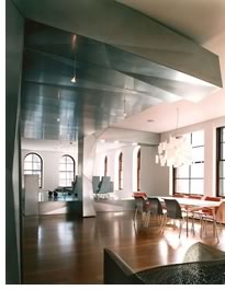 This
project transformed an ordinary, white drywall apartment in a six-story
industrial loft building, with the clients moving in one month after they
closed on the property. Instead of thinking of “homestead”
as a construction, the architect considered it as a line of appliances
that would be installed in this perfectly ordinary house. And just like
the kitchens in the tract homes of the 1950s, the entire home’s
appearance would mimic the line of Hotpoint appliances being used, including
the stove, refrigerator, and dishwasher. The architect brought back old
appliances to “connect the apartment together with their worn and
abstract visage.” The appliances define the place and separate one
function from another. Yet, they still have purpose: “Open the vegetable
drawer and find the home office, open the oven and find the kitchen.”
All in all, the architect says, they are an old idea that still works.
“This project is clearly a different way of living,” the jury
said. “It’s a simple idea with a great deal of richness in
its solution . . . It provides an architecture and language to a calm
and simple space.”
This
project transformed an ordinary, white drywall apartment in a six-story
industrial loft building, with the clients moving in one month after they
closed on the property. Instead of thinking of “homestead”
as a construction, the architect considered it as a line of appliances
that would be installed in this perfectly ordinary house. And just like
the kitchens in the tract homes of the 1950s, the entire home’s
appearance would mimic the line of Hotpoint appliances being used, including
the stove, refrigerator, and dishwasher. The architect brought back old
appliances to “connect the apartment together with their worn and
abstract visage.” The appliances define the place and separate one
function from another. Yet, they still have purpose: “Open the vegetable
drawer and find the home office, open the oven and find the kitchen.”
All in all, the architect says, they are an old idea that still works.
“This project is clearly a different way of living,” the jury
said. “It’s a simple idea with a great deal of richness in
its solution . . . It provides an architecture and language to a calm
and simple space.”
ImageNet, Oklahoma City, by Elliott + Associates Architects, for BMI Systems, Inc. Photo © Robert Shimer, Hedrich Blessing.
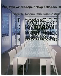 “This
project really tells a story about graphics that are normally thought
of in two dimensions, but have been translated into a real 3D experience,”
explained the jury. “Lots of metaphors, like the stacks of paper
and the paper walls that blend with the graphics story, offer a rich layering
of meanings from a number of perspectives.” This project developed
because BMI Systems, Inc., was to move from its parking-garage home to
new space within the parent company’s corporate headquarters. The
architecture team had several goals: Share the history of the company
through design, create economic and recruitment benefits with consolidation,
instill efficient work flow and employee pride, and create a sales tool
that will add value and create an advantage over and above pride and service.
The team introduced the company’s history and the development of
the photocopy process through the use of historic and rare typewriters
as art objects surrounded by walls of copy paper (390,000 sheets) to represent
the end product. The wall panels of text describe the invention and history
of the copy machine, and the smaller ceiling panels add company history.
Two months after the project completion, a major law firm with a large
scanning/imaging job, which already had interviewed BMI’s competitor,
agreed to a tour of the new facilities, during which they learned about
the BMI history, philosophy, and approach to the design of the building.
One hour after the presentation, the law firm called to tell BMI they
were hired for what proved to be the single largest job in company history.
“The whole story of the business is embedded in the design,”
said the jury. “The design is the business.”
“This
project really tells a story about graphics that are normally thought
of in two dimensions, but have been translated into a real 3D experience,”
explained the jury. “Lots of metaphors, like the stacks of paper
and the paper walls that blend with the graphics story, offer a rich layering
of meanings from a number of perspectives.” This project developed
because BMI Systems, Inc., was to move from its parking-garage home to
new space within the parent company’s corporate headquarters. The
architecture team had several goals: Share the history of the company
through design, create economic and recruitment benefits with consolidation,
instill efficient work flow and employee pride, and create a sales tool
that will add value and create an advantage over and above pride and service.
The team introduced the company’s history and the development of
the photocopy process through the use of historic and rare typewriters
as art objects surrounded by walls of copy paper (390,000 sheets) to represent
the end product. The wall panels of text describe the invention and history
of the copy machine, and the smaller ceiling panels add company history.
Two months after the project completion, a major law firm with a large
scanning/imaging job, which already had interviewed BMI’s competitor,
agreed to a tour of the new facilities, during which they learned about
the BMI history, philosophy, and approach to the design of the building.
One hour after the presentation, the law firm called to tell BMI they
were hired for what proved to be the single largest job in company history.
“The whole story of the business is embedded in the design,”
said the jury. “The design is the business.”
Lutece, Las Vegas, by Morphosis, for Ark Restaurant. Photo © Farshid Assassi.
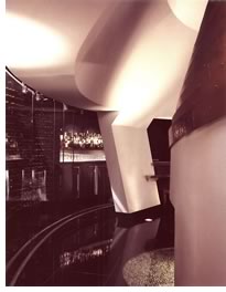 The
design for this Las Vegas restaurant developed as both an architectural
suggestion of, and a foil to, the chaos and immutable movement of the
casino environment. The architect aspired to create an oasis that would
be free of the noisome, frenetic qualities that threaten to encroach from
the casino’s strategically planned insular and disquieting environment.
Through a small portal, serving as “a reverse Alice’s looking
glass,” the diner leaves the chaotic to arrive at the serene and
finds a refuge created through a restrained articulation of materials.
“The space’s geometry emanates from an abstraction of the
classical formal dining room, finding its generative source in the massive
chandelier above the main dining space and evolving through a fluidity
of forms to mediate between the adjacent dining and bar areas,”
according to the architect. A bronze wall in the form of a conical ellipse
wraps around the main dining room, anchored by an elliptical sculpture
set in the floor and composed of 19,000 PVC-cast human figures placed
by hand in the translucent resin base. “Looking at this project
in the context of Las Vegas, this is a wonderfully subtle, sophisticated
place in the midst of chaos; it is a ‘pause’ in a 24-hour
city,” the jury explained. “The simplicity of the elements—the
stark white, the wonderful wood, and the deep black—sets up the
contrast and the enveloping feeling.”
The
design for this Las Vegas restaurant developed as both an architectural
suggestion of, and a foil to, the chaos and immutable movement of the
casino environment. The architect aspired to create an oasis that would
be free of the noisome, frenetic qualities that threaten to encroach from
the casino’s strategically planned insular and disquieting environment.
Through a small portal, serving as “a reverse Alice’s looking
glass,” the diner leaves the chaotic to arrive at the serene and
finds a refuge created through a restrained articulation of materials.
“The space’s geometry emanates from an abstraction of the
classical formal dining room, finding its generative source in the massive
chandelier above the main dining space and evolving through a fluidity
of forms to mediate between the adjacent dining and bar areas,”
according to the architect. A bronze wall in the form of a conical ellipse
wraps around the main dining room, anchored by an elliptical sculpture
set in the floor and composed of 19,000 PVC-cast human figures placed
by hand in the translucent resin base. “Looking at this project
in the context of Las Vegas, this is a wonderfully subtle, sophisticated
place in the midst of chaos; it is a ‘pause’ in a 24-hour
city,” the jury explained. “The simplicity of the elements—the
stark white, the wonderful wood, and the deep black—sets up the
contrast and the enveloping feeling.”
Martin Shocket Residence, Chevy Chase, Md., by McInturff Architects, for Patricia Martin and David Shocket. Photo © Julia Heine.
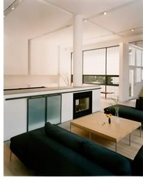 After
the clients bought their 1920s four-square catalog house in an older suburb
of Washington, D.C., they turned their attention to a one-story building
of equal footprint in the backyard. Built as a photographer’s studio,
it was connected from the house by a “hyphen” room that resolved
a half-story level change. The architect set out to integrate the former
studio into a family room, first by opening up the connection between
the two spaces and then orienting the studio-turned-family-room to a wide
side-yard garden. A spare Modern aesthetic contrasts with and complements
the existing house. Steel and glass-block windows offer privacy from neighbors,
and a column-free porch adjusts the room to its various orientations.
The room’s generous dimensions allowed the architect to articulate
walls and ceiling by projecting surface planes into the space without
sacrificing function. Reveals between the planes conceal lights and blinds.
The sparsely furnished room houses a television behind rolling doors,
fireplace, and pool table. A cantilevered bench on a glass block wall
invites repose while the owner runs the table. “The achievement
is remarkable in its transformation from a single characterless room;
every square inch has been thought through, from the wood columns to the
sliding screen of the fireplace. An elegant and refined solution indeed,"
said the jury.
After
the clients bought their 1920s four-square catalog house in an older suburb
of Washington, D.C., they turned their attention to a one-story building
of equal footprint in the backyard. Built as a photographer’s studio,
it was connected from the house by a “hyphen” room that resolved
a half-story level change. The architect set out to integrate the former
studio into a family room, first by opening up the connection between
the two spaces and then orienting the studio-turned-family-room to a wide
side-yard garden. A spare Modern aesthetic contrasts with and complements
the existing house. Steel and glass-block windows offer privacy from neighbors,
and a column-free porch adjusts the room to its various orientations.
The room’s generous dimensions allowed the architect to articulate
walls and ceiling by projecting surface planes into the space without
sacrificing function. Reveals between the planes conceal lights and blinds.
The sparsely furnished room houses a television behind rolling doors,
fireplace, and pool table. A cantilevered bench on a glass block wall
invites repose while the owner runs the table. “The achievement
is remarkable in its transformation from a single characterless room;
every square inch has been thought through, from the wood columns to the
sliding screen of the fireplace. An elegant and refined solution indeed,"
said the jury.
“The Architecture of R.M. Schindler” exhibit at MOCA, Los Angeles, by Chu + Gooding Architects, for the Museum of Contemporary Art. Photo © Linda Pollack.
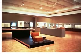 The
architecture team assembled to design and build this exhibit had a number
of objectives. First, under an extremely modest budget, they strove to
create a tactile and spatial backdrop to view various formats of Schindler’s
work without mimicry. Of utmost importance was the exhibits’ ability
to evoke the spirit of experimentalism in Schindler’s work without
the use of overt references. Second, the team committed to creating a
display system that would bring a sense of coherence to the variety of
formats of works on display while resolving the conflict between the overwhelming
scale of the gallery and the relatively small-scale artwork. Another challenge
for the team was the need to create a first space within 20 feet that
would prepare the viewer to focus on small-scale and subtle drawings.
The jury agreed that “the project’s detailing is in the spirit
of Schindler but not overbearing. It represents the tradition of Schindler
without overtaking the exhibit. The details—integration of illustrations
and models—are handled with intense care.” They found the
quality of assembly of materials to be remarkable and were impressed by
the project’s quiet and appropriate inventions. “The designer
captured Schindler’s technique of playing vertical against horizontal
planes . . . big shooting planar surfaces moving from one gallery to another,”
the jury concluded. “This exhibit can really be pulled off wonderfully
in any gallery space because it’s quite separate from the space.
It’s very tactile—playing soft against hard, smooth against
rough.”
The
architecture team assembled to design and build this exhibit had a number
of objectives. First, under an extremely modest budget, they strove to
create a tactile and spatial backdrop to view various formats of Schindler’s
work without mimicry. Of utmost importance was the exhibits’ ability
to evoke the spirit of experimentalism in Schindler’s work without
the use of overt references. Second, the team committed to creating a
display system that would bring a sense of coherence to the variety of
formats of works on display while resolving the conflict between the overwhelming
scale of the gallery and the relatively small-scale artwork. Another challenge
for the team was the need to create a first space within 20 feet that
would prepare the viewer to focus on small-scale and subtle drawings.
The jury agreed that “the project’s detailing is in the spirit
of Schindler but not overbearing. It represents the tradition of Schindler
without overtaking the exhibit. The details—integration of illustrations
and models—are handled with intense care.” They found the
quality of assembly of materials to be remarkable and were impressed by
the project’s quiet and appropriate inventions. “The designer
captured Schindler’s technique of playing vertical against horizontal
planes . . . big shooting planar surfaces moving from one gallery to another,”
the jury concluded. “This exhibit can really be pulled off wonderfully
in any gallery space because it’s quite separate from the space.
It’s very tactile—playing soft against hard, smooth against
rough.”
South Court, New York Public Library, New York City, Davis Brody Bond, LLP, for the New York Public Library. Photo © Peter Aaron/ESTO.
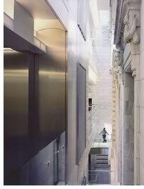 This
project, a new, 42,500-square-foot, three-story structure, resides in
the open south courtyard of the New York Public Library, a national landmark
building. The new $29 million building accommodates the library’s
public education program as well as administrative/staff support, plus
an electronic teaching center, auditorium, administrative offices, and
an employee lounge located on the glass-walled top floor. The original
building, completed in 1911, has earned its place as a remarkable and
historically significant New York City structure. In designing a new building
within this space, the architect acknowledged the importance of creating
a modern structure respectful of its historic Beaux Arts elder, yet one
that offers an important contemporary addition to the institution itself.
Consequently, the new structure contains a level of detail comparable
to that of the original. Skylights adorn the entire structure, while the
floor, set back from the existing stone walls of the courtyard, reveals
the façade to the public for the first time. The original foundation
walls are exposed at the bottom of a glass staircase, which descends from
the first floor to the auditorium. The upper floors are cantilevered,
held back from the original walls by glass partitions, thus adding to
the feeling of transparency. “The new building is really a non-building
that subdues itself in order to highlight and reveal the beauty of the
existing historic building,” the jury noted. “This is a very
good way to give the space ‘air’ and openness. It is an elegant
resolution.”
This
project, a new, 42,500-square-foot, three-story structure, resides in
the open south courtyard of the New York Public Library, a national landmark
building. The new $29 million building accommodates the library’s
public education program as well as administrative/staff support, plus
an electronic teaching center, auditorium, administrative offices, and
an employee lounge located on the glass-walled top floor. The original
building, completed in 1911, has earned its place as a remarkable and
historically significant New York City structure. In designing a new building
within this space, the architect acknowledged the importance of creating
a modern structure respectful of its historic Beaux Arts elder, yet one
that offers an important contemporary addition to the institution itself.
Consequently, the new structure contains a level of detail comparable
to that of the original. Skylights adorn the entire structure, while the
floor, set back from the existing stone walls of the courtyard, reveals
the façade to the public for the first time. The original foundation
walls are exposed at the bottom of a glass staircase, which descends from
the first floor to the auditorium. The upper floors are cantilevered,
held back from the original walls by glass partitions, thus adding to
the feeling of transparency. “The new building is really a non-building
that subdues itself in order to highlight and reveal the beauty of the
existing historic building,” the jury noted. “This is a very
good way to give the space ‘air’ and openness. It is an elegant
resolution.”
Central Synagogue, New York City, by Hardy Holzman Pfeiffer Associates, LLP, for Central Synagogue. Photo © Peter Aaron/ESTO.
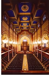 This
is a “fabulous building made outstanding,” the jury enthused.
“It’s more than one would expect in a restoration project.”
The architect believed that of all late-19th century New York City structures,
none conveys greater optimism in the future of America than this synagogue.
Designed by Henry Fernbach, often cited as the first Jewish architect
in America, it cues off of a traditional basilica plan and is remarkable
for its high-Victorian, Moorish-inspired design. In 1998, a fire severely
damaged the building, as did the thousands of gallons of water used in
its rescue. Miraculously, the Ark, while damaged, remained largely unscathed.
Rather than start from new, the congregation decided they would rather
rebuild within the historic walls, and thus the architect met the charge
to create a detailed restoration that celebrated the synagogue’s
historic character while making the building a more functional contemporary
space for worship. To bring the synagogue into the 21st century, the architect
updated the building systems; installed state-of-the-art audio and video
systems; reconfigured the sanctuary, foyer, and entrance stair; and led
extensive excavation and renovation of the lower levels so that they could
become a multipurpose hall and mechanical room. The jury loved the project’s
exuberance and care not to be too flashy. “There are challenges
in restoration with the infrastructure—air and telecommunications—and
yet there’s no sign of this,” they remarked. “These
challenges never interrupt the restoration and beauty.”
This
is a “fabulous building made outstanding,” the jury enthused.
“It’s more than one would expect in a restoration project.”
The architect believed that of all late-19th century New York City structures,
none conveys greater optimism in the future of America than this synagogue.
Designed by Henry Fernbach, often cited as the first Jewish architect
in America, it cues off of a traditional basilica plan and is remarkable
for its high-Victorian, Moorish-inspired design. In 1998, a fire severely
damaged the building, as did the thousands of gallons of water used in
its rescue. Miraculously, the Ark, while damaged, remained largely unscathed.
Rather than start from new, the congregation decided they would rather
rebuild within the historic walls, and thus the architect met the charge
to create a detailed restoration that celebrated the synagogue’s
historic character while making the building a more functional contemporary
space for worship. To bring the synagogue into the 21st century, the architect
updated the building systems; installed state-of-the-art audio and video
systems; reconfigured the sanctuary, foyer, and entrance stair; and led
extensive excavation and renovation of the lower levels so that they could
become a multipurpose hall and mechanical room. The jury loved the project’s
exuberance and care not to be too flashy. “There are challenges
in restoration with the infrastructure—air and telecommunications—and
yet there’s no sign of this,” they remarked. “These
challenges never interrupt the restoration and beauty.”
Copyright 2003 The American Institute of Architects. All rights reserved.
![]()
| 2003 Honor Awards for Interiors Jury Chair Lawrence Scarpa, AIA Sara E. Caples, AIA Olvia Demetriou, FAIA Debbra A.K. Johnson Juan Miró, AIA See also: |
|