
AIA North Carolina Announced 2002 Design Awards
AIA North Carolina announced the winners of its 2002 Design Awards competition at the chapter's annual Design Awards Banquet in Asheville, N.C., August 24. A record 14 winning projects were selected from a field of 109 entries submitted by AIA members in North Carolina.
The 2002 Awards Jury reviewed all entries and made its selections in a July meeting in Phildelphia. Serving on the jury were Bernard J. Cywinski, FAIA, Bohlin Cywinski Jackson; Daniela Holt Voith, AIA, Voith & MacTavish Architects; and James Winkler, AIA, Converse Winkler Architecture, all principal partners in Philadelphia firms.
Following are the award winners with jury comments.
Honor Awards
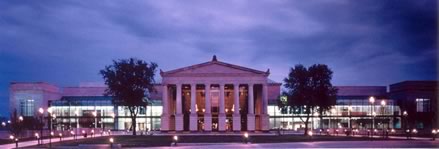
• Fletcher Opera
Theater and Meymandi Concert Hall, BTI Center for the Performing Arts
by Pearce Brinkley Cease +
Lee, PA, Raleigh.
The jury initially received two submissions on this project: new wing
additions to an existing auditorium. While these two additions were completed
on different dates, the jury felt that the project needed to be judged
as a single offering. There's a sophisticated balancing of masses, with
beautifully integrated elements of old and new. The additions have a well-balanced
and symmetrical composition. The height of the buildings was well-resolved
with controlled massing. Overall, the projects were well-detailed, and
the use of authentic materials created people-friendly environments. The
drawings are comprehensive and totally complete to explain the project.
A thoroughly professional job.
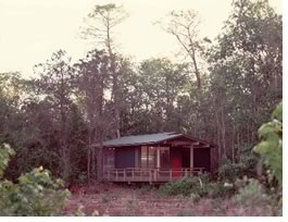 •
Outdoor Classroom by Frank
Harmon, Architect, Raleigh.
•
Outdoor Classroom by Frank
Harmon, Architect, Raleigh.
There is beautiful detail here. The project's siting and soft landing
on the landscape are extraordinary. Visiting here would be a pleasure
of the senses. What better way to teach than to inhabit this space. The
elevation off the ground lends a wonderful quality. This is elegance on
a stringent budget—neat, cleanly done, and environmentally friendly.
• Hayes Cucchiara
Residence by Dixon Weinstein
Architects, Chapel Hill.
We like the clarity of this project's parti; its restraint and simplicity.
There's an almost Zen-like serenity of the regional vernacular forms.
The initial rigidity falls away when you see how the connections work
together. The detailing is wonderful as you go from open to closed in
an episodic way.
• Plush by
Kenneth Hobgood Architects, Raleigh.
We were taken by the restraint in this project. It has a clear, straightforward
plan and an exciting yet calm environment. It's very sophisticated and
clean. The recessed lights help to showcase the displays. A very "plush"
project. The drawings are beautifully executed.
• Lord Corporation
World Headquarters by The
Freelon Group, Durham.
Care has been taken with the landscape and relationship to the building.
There is a simple clarity of plan here, with very fine detailing and resolution.
The whole plan was just beautiful.
• Scott + Stringfellow
Office Fitup by Gomes + Staub
PLLC, Raleigh.
A very elegant composition and a sophisticated space. We're impressed
by the overall restraint of the project and the presentation given a limited
budget. Beautiful drawings and photos. The jury was surprised and pleased
by the black-and-white photo presentation. The detailing of the project
was consistent throughout.
• Helios Coffee/Carson
Medlin Building by Clearscapes,
PA, Raleigh.
The architects used a mundane and pedestrian building and turned it into
something inviting. The lighting is informed and thoughtful. We applaud
the before and after pictures in the project submission. The drawings
were great—consistent with the design result.
Merit Awards
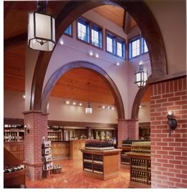 •
Biltmore Estate Winery Addition by
Little & Associates Architects, Charlotte.
•
Biltmore Estate Winery Addition by
Little & Associates Architects, Charlotte.
This project was seamless. It was resolved within the vocabulary of the
historic building and done tastefully with a nod to the original architect,
Richard Morris Hunt. The display space is very clear and the whole project
is simply detailed. The submission was a testament to the power of architectural
drawings.
• RDU Entrance
Markers by Pearce Brinkley
Cease + Lee, PA, Raleigh.
There is a real spirit to this project. The architects obviously are very
deft with the handling and use of graphics. The sign is eminently legible
and has substance. It speaks of the modernity that the airport thrives
on. A sign you can find. It has a magical quality. The lighting is very
successful. The fact that it is not a building holds a special place in
our hearts. The consistency of the presentation matches the elegance with
which the project is carried out.
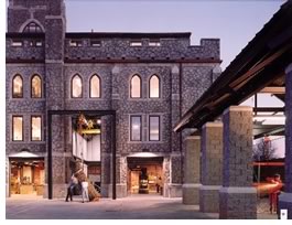 •
McColl Center for Visual Arts FMK
Architects, Charlotte.
•
McColl Center for Visual Arts FMK
Architects, Charlotte.
The project gains strength from the building envelope and the insertion
of new activity within the skeleton. The way the old meets the new is
very clear. The clerestory windows are a stroke of ingenuity. We appreciate
the nitty-gritty of the creative process here. It looks like a dreamy
place to work. The project allows for the historic building to once again
give back to the community.
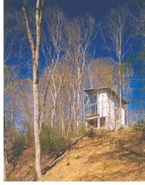 •
The Honeymoon Cottage by Vincent
Petrarca, Raleigh.
•
The Honeymoon Cottage by Vincent
Petrarca, Raleigh.
This project tugged at the jury's romantic sensibilities. We liked the
siting and verticality set within the treed environment. Very simple detailing
and massing. It's nice to see someone who has a great eye at the beginning
of their career. The project almost has a Scandinavian and transcendent
quality. There's a great deal of comprehensive geometry here, which did
not become overdone. The jury is overall taken by great simplicity—less
really is more.
• The Sourwood
Inn by Samsel Architects,
PA, Asheville.
We were taken with the color and tactility of the wall. A thoroughly appropriate
response to topography where the building wraps the hill. It looks like
a wonderful place to spend some time. The stylistic interpretation is
appropriate for the area. The architects could have taken a Disneyland
approach but instead chose to be very honest and non-ironic. The whole
project works quite beautifully.
• United Church
of Chapel Hill by Cherry Huffman
Architects, Raleigh.
We appreciate the cleanliness and warmth that the materials are given.
The way light comes into the sanctuary is beautiful. There is a simple
pallet of materials that is comforting. This may be an example of traditional
Modernism—if there is such a thing. Spirited elements within the
window elevations animate the project. The planes that constitute the
space, capture and add a generous amount of light. There is a sculptural
quality to the brick walls. The fellowship hall is quite nice. The plan
parti is again very clear.
• The Hill Center
by The Freelon Group, Durham.
The massing was striking and the simplicity of geometry and materials
worked well. The project is spatially rich because of the roof and its
simplicity. The jury was taken with the linkage of discrete masses along
a spine, which dealt with event and connection. The project creates a
domestic scale in an institutional building. A wonderful place to learn
and it would be good with or without the tower.
Copyright 2002 The American Institute of Architects. All rights reserved.
![]()
| For more information about AIA North Carolina or the awards program, visit www.aianc.org. Video presentations of each of the award winners can be viewed online. |
|